Part of the beauty of working with data is how many interesting things you learn. For instance, this week we discovered that Fantine from Les Miz coughs more than any other character, Raiders of the Lost Ark looks a little like a Family Circus cartoon, and that Canada’s leaders are the most educated in the world. But that’s just the beginning. Take a peek below at this week’s roundup of all things data for the best in information design. Missed last week’s post? Get caught up here.
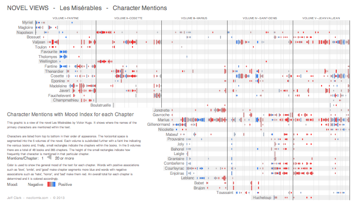
Novel Views

To coincide with the recent release of the film, Novel Views is a series of visualizations of the novel Les Misérables by Victor Hugo. The text was analyzed in a number of ways to produce visualizations of character mentions, word connections and the verbs associated with each character.
Bar-Chart Chip Creates Infographic from Blood Measurements

The chip is only about the size of a credit card, but it is able to reveal 50 test results, including insulin levels, cholesterol and bacterial infections, from just one small sample of blood by linking measurements of concentration with oxygen production. View a video all about this fantastic chip over at Infosthetics.
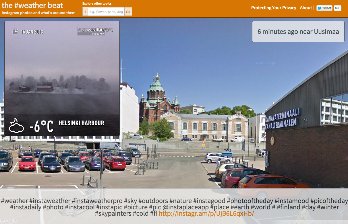
The Beat

The Beat is a wonderful experiment that combines Instagram photos with Google Streetview to encourage users to explore topics in a new way.
How Educated Are Our World Leaders?

An eye-opening visualisation that details the education level of our world leaders.
Women as Academic Authors

Despite women having a greater presence in higher education, the number of women who are authors of scholarly papers remains low. Explore data from the past 400 years with this visualisation that illustrates the academic fields which have the most female authors, and which have the fewest.
London Underground: 14 Alternative Tube Maps

Last week saw the London Tube celebrate it’s 150th anniversary, and to mark this occasion The Guardian collected together some of the best alternative graphics inspired by the iconic tube map. For some background reading, do check out the history of the London Tube map, also by The Guardian. A fascinating process!
How Fast Could You Travel Across the U.S. in the 1800s?

A great selection of vintage maps detailing rates of travel across the U.S. from 1800 to 1930. Using New York City as a starting point, contour lines mark how far one could travel in a specific time period, highlighting just how quickly the U.S. rail system developed.
Star Wars Maps by Andrew Degraff

Want to know how far your favorite movie characters travelled? Well, now you can thanks to Andrew Degraff who has created these fantastic maps visualising the travels of the main characters in movies such as Star Wars, Indiana Jones and The Goonies.
Finding Stories and Telling Stories by Andy Kirk

Interested in learning how to find and tell great stories with data? Well look no further than Andy Kirk’s (of Visualising Data fame) presentation, which takes you from finding the right data set, right through to tips on how best to present the story visually. Kirk recently stopped by our L.A. office to teach a class on the subject (stay tuned for more on that)!
Tags: data, data visualizaton, datavisualization, dataviz, featured, graphics, The Graphic Account, Tiffany Farrant-Gonzalez, tiffanyfarrantgonzalez, weekly roundup
Join the Conversation