PLES MOŽGANOV, or “Braindance”, is an experiment bridging the gap between science and art. 20 volunteers were put into a black box with no stimuli except for sound, and as their brainwaves were measured, they listened to an audio track they had never heard before. The experiment drew from how much the listener could concentrate, […]
Tag: datavisualization
Merry JESSMas!!!
It’s been a crazy year and guess what – it’s only gonna get crazier! So let’s take a very quick moment to take a breath and wish each & every one of you a very happy Christmas and a happy & healthy New Year!!!
The Metrics of Winning: How Fantasy Baseball Can Help Us Understand Data Big and Small
Finding a winning formula, whether it’s in sports or in marketing, isn’t about perfection or even hitting benchmarks — it’s about being better than the rest. The right data can help you get ahead of the competition, but you don’t need to be a number cruncher to develop useful metrics.
The Graphic Account: 1-16-13
This week we discovered that Fantine from Les Miz coughs more than any other character, Raiders of the Lost Ark looks a little like a Family Circus cartoon, and that Canada’s leaders are the most educated in the world.
The Graphic Account: 1-7-13
Welcome to our new, weekly roundup of all things data related! Each week we’ll be posting essential articles, news, recaps of goings on and plenty of inspiration from the world of information design. Enjoy!
Happy Hanukkah!
Hanukkah starts tomorrow, December 8th! Wish your friends a happy and properly-spelled holiday, courtesy of JESS3.
Information Design: If Glenn Beck Can Do It, You Can Do It
On Wednesday night, I was invited to speak on one of the least talked about topics on the web right now: Infographics. And by least, I actually mean most. “If you take away just one thing from my talk tonight let it be this,” I said to a packed house on Ogilvy PR’s 10th floor, […]
Data Visualization for the Public Sector
Data Visualization for the Public Sector View more presentations from JESS3. Based on the talk I delivered at Pew’s Voting Information Technology Summit, a quick diagnostic to give yourself if you are in the public sector (or any sector for that matter) as you head into 2011: 1. ‘Users make credibility-based decisions based on how […]
a Primer in Data Visualization
This is a presentation I gave last night at Refresh Baltimore. I have also embedded the videos that I played below. A Primer in Data Visualization View more presentations from JESS3. A big thanks to everyone who came out and to the organizers Mike Brenner and Javier Rios for including me in their main fall […]
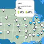
real time Election Day foursquare check-ins visualized by JESS3
As of 5:30 PM EST, there have been 28,959 check-ins at 16,233 polling locations with 59% of the check-ins coming from men and 41% coming from women. Check out the map we designed and are powering with foursquare’s API data, which was geocoded with help from Voting Information Project (Pew / Google / Engage). More […]