Welcome to our new, weekly roundup of all things data related! Each week we’ll be posting essential articles, news, recaps of goings on and plenty of inspiration from the world of information design. Enjoy!
+ Eyeo Festival Speakers Announced

The Eyeo speakers have finally been announced, and the wait has been well worth it! Once again, Eyeo looks to be one of the most highly anticipated conferences of the year with talks from Bill Atkinson, Nicholas Felton, Stefanie Posavec, Georgia Lupi and Ben Fry. Bringing together some of the most influential individuals working with data, the 4-day event, taking place in Minneapolis, promises to be an enlightening experience with inspirational talks, demos and labs. View the full list of speakers here.
+ Call for Entries for Malofiej 21

Enrollment for the Malofiej 21 Awards is now open and you can submit entries up until February 15th 2013! Since 1993, the Malofiej Awards (run by the Society for News Design, and named after Alexander Malofiej, an Argentinian cartographer) have given recognition to the best infographics published in print and online.
Last year they received 1,513 entries from 148 media organisations across 29 countries, setting a record for participation. Winners included The New York Times and National Geographic. Find out how to submit your 2012 work here.
+ Announcement of OpenVis Conference
OpenVis is a new single-track conference focusing on storytelling and visualising data on the web. Taking place in Boston on May 16-17, with Amanda Cox (graphics editor at The New York Times) already lined up to kickoff the event as the keynote, OpenVis is set to be an exciting new event in the data visualisation space. We’re looking forward to future speaker announcements!
+ Four Values Can Still be Worth a Chart
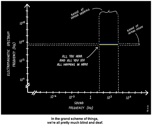
Information graphics don’t always need to be crammed full of data to tell a story, sometimes 4 values is enough to make an impact, as pointed out by Robert Kosara over at Eager Eyes, while discussing the following chart by Abstruse Goose, which highlights that “in the grand scheme of things, we’re all pretty much blind and deaf”.
+ A Fantastic Year for Data Journalism – A Roundup of the Best Interactives
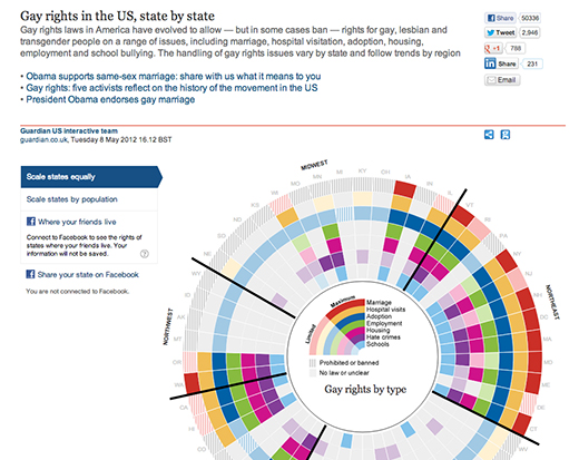
The Columbia Journalism Review rounds up some of the best interactive visualisations of 2012 including ‘Gay Rights in the US’ by The Guardian. Shown below:
+ Below the Boat
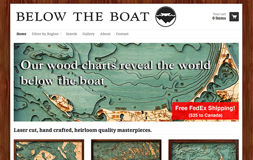
Beautiful wooden charts that reveal the world beneath the waves.
+ TripsQ
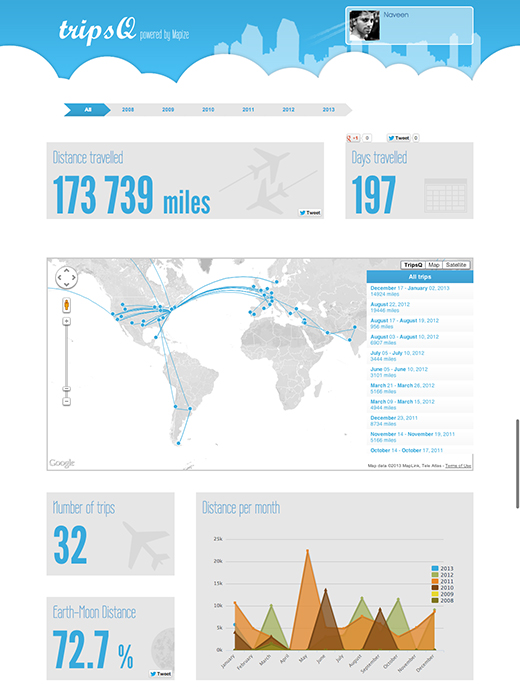
Powered by Mapize, TripsQ allows you to create handy reports from your FourSquare data.
+ Kidlit Maps
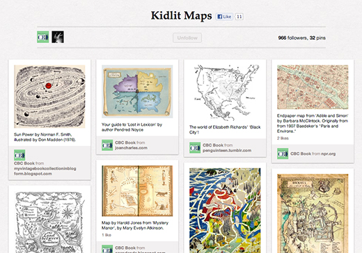
A wonderful Pinterest board that highlights some of the wonderful maps that crop up in children’s literature from Harry Potter to Swallows and Amazons.
+ 100 Diagrams that Changed the World
A wonderful collection of some of the most influential sketches, illustrations and diagrams that shaped the way we think about the world and beyond. Drawing examples from cave paintings right up to the schematics of the iPod, this book shows the viewer the power of the humble diagram.
+ On the Map
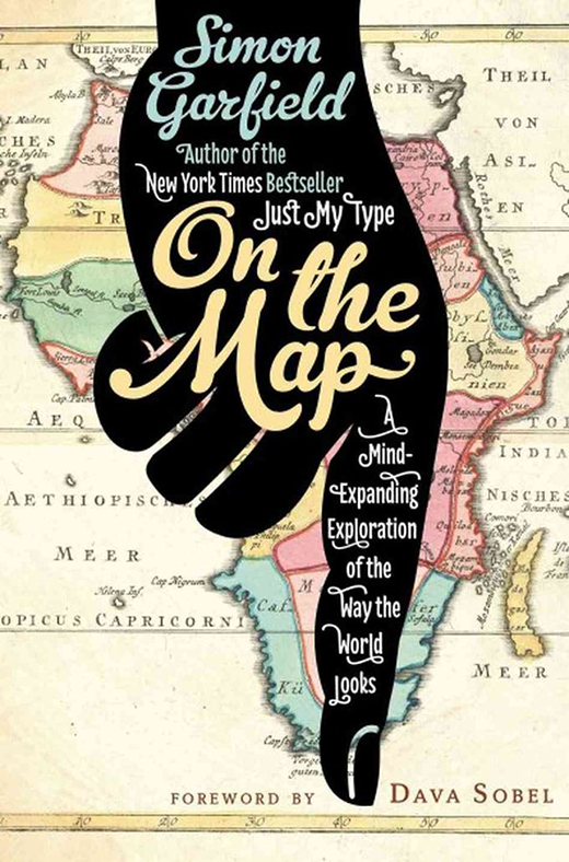
Why do maps seem to resonate with us so strongly? What drives our desire for visual sensemaking? On the Map is a fascinating book that takes a close look at the intriguing relationship between man and map.
Tags: data, Data Visualization, datavisualization, dataviz, featured, graphics, roundup, The Graphic Account, Tiffany Farrant-Gonzalez, tiffanyfarrantgonzalez, weekly dataviz
Join the Conversation