I always get excited when a new infographic launches. It’s like sending your child off to the first day of school. Seeing all the hours of design work your team has put in finally payoff in an amazing product is very fulfilling. Today, this feeling is even more amplified because of the importance of the subject matter behind our new infographic.
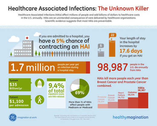
JESS3 partnered with GE to create an infographic that visualizes the devastating impact of Healthcare Associated Infections (HAIs). HAIs are the most common complication of hospital care and a relatively unknown killer. To combat this problem, GE’s Healthcare division created a program that hospitals will be able to use to help reduce the number of HAIs patients receive.
When I first saw the data that was to be incorporated into the infographic, one fact that jumped out at me was that more people die in the U.S. from HAIs than breast cancer and prostate cancer combined. Even more astonishing was that scientific evidence suggests most HAIs are preventable. After learning this, my first thought was, “Why hadn’t I heard about this before?” My second thought was, “This information needs to get out to the public.”
Inspired to spread awareness about this important issue, the JESS3 team put our heads together to brainstorm ways to best lay out the data. We wanted to easily present the facts behind HAIs including: how the length of a hospital stay increases your risk, what monetary effects HAIs have on the healthcare system, and how many lives HAIs take compared to diseases people are more aware of (e.g. heart disease, breast cancer, etc.).
For the visual, we wanted something that would grab people’s attention, while still reflecting the serious nature of the content. To do this, we used the GE brand palette, mixing it with iconography to create a balance between being visually engaging and respectful of the subject matter.
The initial concept was a flow cart that reflected the data. During the second round of refinement, we gave the data more flow and narrative by mixing the illustrative charts with the structure of the flow chart. This evolution involved going through a few versions to refine the relationships between the data and to create the clearest narrative.
And here’s the final product (click to enlarge):

Tags: data visualizaton, GE healthcare division, graphic design, HAI, healthcare, healthcare associated infections, infographic, infographics, making of an infographic, robin richards
Join the Conversation