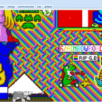
The thing about running an advertising agency is you hardly ever do any advertising for yourself. But stickers and T-shirt’s are those precious things we allow ourselves time for.

Stickers are Fun
![]() by Jesse Thomas
by Jesse Thomas
![]() by Jesse Thomas
by Jesse Thomas
The thing about running an advertising agency is you hardly ever do any advertising for yourself. But stickers and T-shirt’s are those precious things we allow ourselves time for.
See you later Ultra Violet!
Reddit shows us how we can harness the massive potential of collaborative group art.
@coffeecupsoftheworld curates the coolest coffee cups from around the world.
![]() by Jesse Thomas
by Jesse Thomas
@sean_charmatz’s super cute characters will make your day.
![]() by Jesse Thomas
by Jesse Thomas
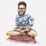
Maybe celebrities need to rethink their social strategy and just start posing on top of sandwiches?

The latest tunes getting rotation from the JESS3 team. Stay creative & on task with these 5 laid back yet tasty tracks.

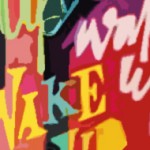
German agency Cheil combines pop images in Upday campaign.
![]() by Jesse Thomas
by Jesse Thomas
Do you like sending your friends postcards? Victor Ving leaves them behind

![]() by Jesse Thomas
by Jesse Thomas
Some of the most inventive and fun illustration you will ever see