Like most aspects of a design project, finding the perfect font is a frustrating, but rewarding, task. And of course, what that “perfect” font is will always be different, depending on the task at hand. But for over a century, designers have agreed that in terms of pure beauty, the Doves Press typeface is one of the best.
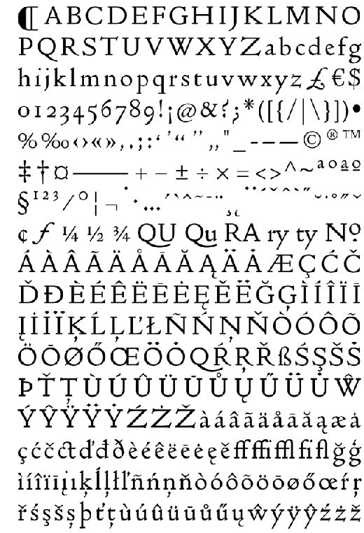
Doves Press was a turn of the century publisher in London that took pride in the handcrafted, locally-sourced, artisan quality of its wares – in other words, it would have been right at home on Etsy. When it failed, one of the partners tossed their proprietary typeface into the Thames so that it could not be used by anyone else. With that, the font became the typographical equivalent of Atlantis.
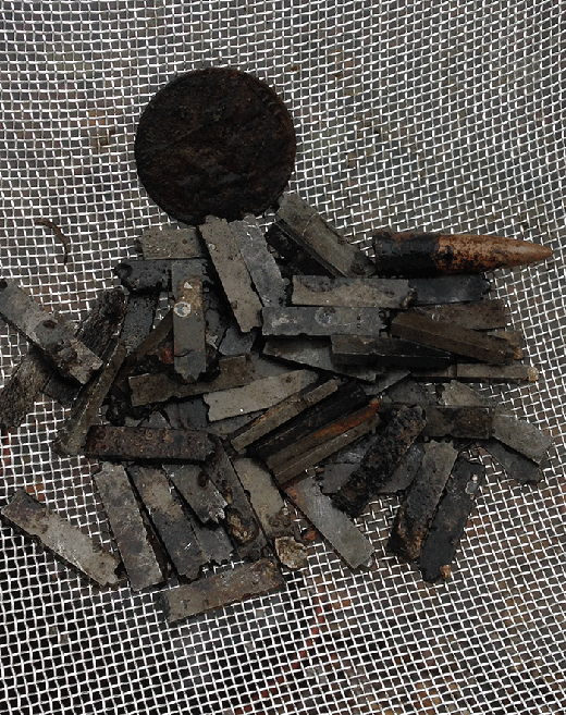
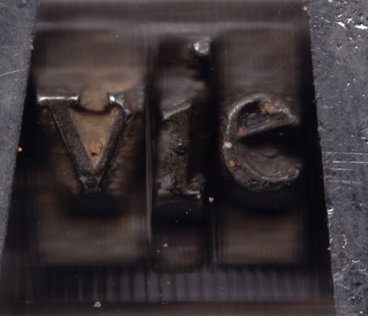
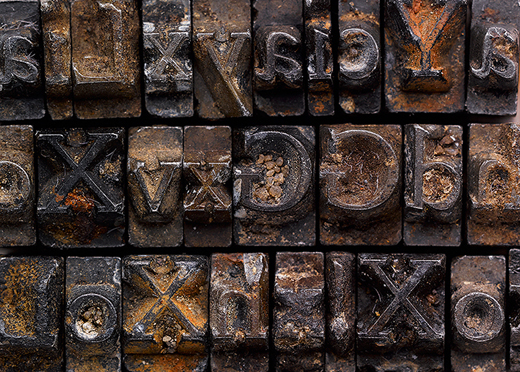
But in November of last year, a search team found the plates. And now, a digital recreation of the font is available from Typespec. It’ll cost you £40.00, but it’s cheaper than paying your own divers.
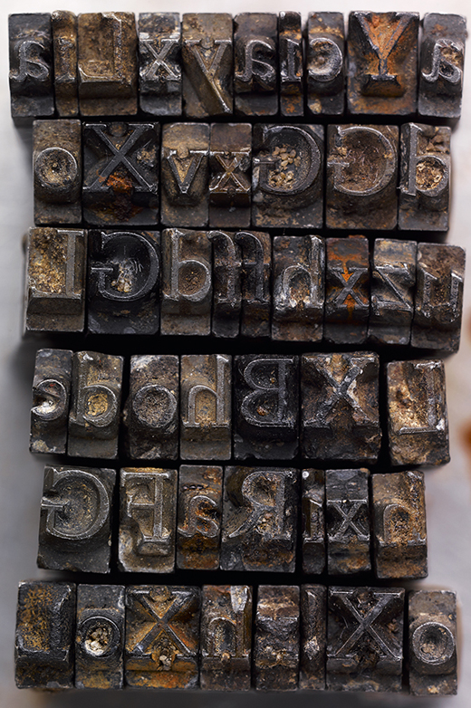
Check out the Doves Type® here.
Sources:
http://www.typespec.co.uk/doves-type/
Join the Conversation