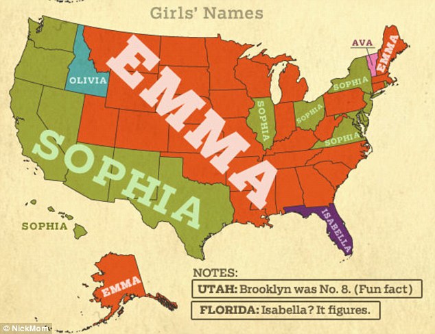
I’ve heard the name ‘Jennifer’ called about 20x for food orders. Just think in about 15 years it’ll be ‘Hashtag’ & ‘Blue Ivy’ #popularnames
— Jen Mitchell (@buriedwithkids) January 3, 2013
Since pre-school there was at least 1-2 people in my class that had the names michael, william(s) and jones.. #popularnames
— Mikeveli (@MikeBlvd_) November 24, 2011
@myers41 Mine is Hayden. He has ayden, jayden, cayden and brayden in class. I was one of 12 megans in my graduating class. #popularnames
— Megan Belcher (@Oh_m_b) July 20, 2011
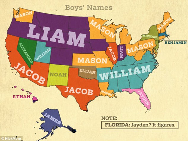
Guys names on the other hand has more varieties in terms of popularity but there seem to be a cluster if Southeastern states that loves the name William. The name Liam on the other hand controls a big portion of the Western states.
I’ve heard the name ‘Jennifer’ called about 20x for food orders. Just think in about 15 years it’ll be ‘Hashtag’ & ‘Blue Ivy’ #popularnames
— Jen Mitchell (@buriedwithkids) January 3, 2013
Since pre-school there was at least 1-2 people in my class that had the names michael, william(s) and jones.. #popularnames
— Mikeveli (@MikeBlvd_) November 24, 2011
@myers41 Mine is Hayden. He has ayden, jayden, cayden and brayden in class. I was one of 12 megans in my graduating class. #popularnames
— Megan Belcher (@Oh_m_b) July 20, 2011
Guys names on the other hand has more varieties in terms of popularity but there seem to be a cluster if Southeastern states that loves the name William. The name Liam on the other hand controls a big portion of the Western states.

Talk about big data! This week we found a map of the Internet, an infographic of the loneliest islands on Earth, and a visualization of the distance to Mars in pixels. We think you’ll also get a kick out of a video game based on infographics and Persian rugs made from Google Maps images. After you’ve caught up on the best in this week’s information design, check out our past posts.
[Infographic] Loneliest Islands

Inspired by Judith Schalansky’s Atlas of Remote Islands, this infographic created by Kanny Yeung shows the 50 loneliest islands on Earth ranking each island by number of inhabitants and it’s proximity to other islands.
[App] Map of the Internet

This app is a 3D visualization of the worldwide system of networks that connect together to form the Internet. The map shows ISPs, exchange points, and organizations that route online traffic and allows you to zoom in, pan and explore these global connections at a mind-blowing level of detail. Grab it now for free for both Android and iPhone!
[Visualization] British Casualties in Afghanistan

LONO, a UK based creative agency, tasked themselves with making the numbers surrounding British troop casualties in Afghanistan more accessible to a wide audience. Without a key this visualization may not be the easiest to read as it isn’t 100% clear that the colours represent the different years, however by breaking down the data by year and by month they have painted a vivid picture of these staggering numbers.
[Visualization] Out of Sight

A startling visualization that tells the story of the thousands of people killed by U.S. drone attacks in Pakistan. The aim of this project was not to speak for or against the usage of drones, but to bring to light the topic and to inform the public so they are able to form their own opinion based on the evidence.
[App] Future Urban World

Over 50% of the world’s population lives in an urban world, driving significant economic transformations. This app by McKinsey & Company seeks to help users understand the sheer scale of urbanization by plotting economic and demographic data onto interactive maps, giving them access to figures about population, household incomes and GDP.
[Game] Metrico Chart Game

Metrico is, at it’s core, a puzzle game for the PS Vita, but what makes this game unique, is that is centres around a world created from charts. The idea came to the creators after they noticed how beautiful infographics can look as an art form, and subsequently drove the style and type of interaction throughout the rest of the game.
[Cartography] Google Maps as Persian Rugs

Ever wondered what a map would look like as a rug? Well now you can! David Thomas Smith’s latest project called Anthropocene involves stitching together thousands of Google Maps images into complex patterns inspired by intricately detailed Persian rugs. Stunning!
[Visualization] Distance to Mars

It’s often hard to fully comprehend the unfathomable distances of space, but this handy little graphic-based visualization aims to put things in perspective by showing you the distance to Mars in pixels. Mind-blowing!
[Video] Kobe Bryant’s Salary

Every 60 seconds Kobe Bryant earns $162.55, which stands in stark contrast to a U.S. minimum wage worker who would earn around $0.12 for the same amount of time. This short video by CNN Money really highlights just how effective and poignant a simple chart can be.
]]>
Talk about big data! This week we found a map of the Internet, an infographic of the loneliest islands on Earth, and a visualization of the distance to Mars in pixels. We think you’ll also get a kick out of a video game based on infographics and Persian rugs made from Google Maps images. After you’ve caught up on the best in this week’s information design, check out our past posts.
[Infographic] Loneliest Islands
Inspired by Judith Schalansky’s Atlas of Remote Islands, this infographic created by Kanny Yeung shows the 50 loneliest islands on Earth ranking each island by number of inhabitants and it’s proximity to other islands.
[App] Map of the Internet
This app is a 3D visualization of the worldwide system of networks that connect together to form the Internet. The map shows ISPs, exchange points, and organizations that route online traffic and allows you to zoom in, pan and explore these global connections at a mind-blowing level of detail. Grab it now for free for both Android and iPhone!
[Visualization] British Casualties in Afghanistan
LONO, a UK based creative agency, tasked themselves with making the numbers surrounding British troop casualties in Afghanistan more accessible to a wide audience. Without a key this visualization may not be the easiest to read as it isn’t 100% clear that the colours represent the different years, however by breaking down the data by year and by month they have painted a vivid picture of these staggering numbers.
[Visualization] Out of Sight
A startling visualization that tells the story of the thousands of people killed by U.S. drone attacks in Pakistan. The aim of this project was not to speak for or against the usage of drones, but to bring to light the topic and to inform the public so they are able to form their own opinion based on the evidence.
[App] Future Urban World
Over 50% of the world’s population lives in an urban world, driving significant economic transformations. This app by McKinsey & Company seeks to help users understand the sheer scale of urbanization by plotting economic and demographic data onto interactive maps, giving them access to figures about population, household incomes and GDP.
[Game] Metrico Chart Game
Metrico is, at it’s core, a puzzle game for the PS Vita, but what makes this game unique, is that is centres around a world created from charts. The idea came to the creators after they noticed how beautiful infographics can look as an art form, and subsequently drove the style and type of interaction throughout the rest of the game.
[Cartography] Google Maps as Persian Rugs
Ever wondered what a map would look like as a rug? Well now you can! David Thomas Smith’s latest project called Anthropocene involves stitching together thousands of Google Maps images into complex patterns inspired by intricately detailed Persian rugs. Stunning!
[Visualization] Distance to Mars
It’s often hard to fully comprehend the unfathomable distances of space, but this handy little graphic-based visualization aims to put things in perspective by showing you the distance to Mars in pixels. Mind-blowing!
[Video] Kobe Bryant’s Salary
Every 60 seconds Kobe Bryant earns $162.55, which stands in stark contrast to a U.S. minimum wage worker who would earn around $0.12 for the same amount of time. This short video by CNN Money really highlights just how effective and poignant a simple chart can be.
]]>
The data visualizations we found this week are extensive in their scope: a whole year in the life of a man, every recorded meteorite, all the Twitter relationships between the company’s employees. That much data is hard to sum up, so we’ll dive right in! After you’ve caught up on the best in this week’s information design, check out our past posts.
[Information Design] Felton’s 2012 Annual Report

It’s that time of year again! Nicholas Felton has released his annual report. To meticulously record his day-to-day activities this year, he used a custom-built iPhone app called Reporter. Each day at random intervals the app would send him reminders to fill in a short survey with data that formed the basis of his beautifully designed report. Check it out!
[Book] Map of the World

A fascinating collection of work by the new generation of map makers and illustrators that not only takes a look at more traditional forms of cartography, but also features an array of contemporary examples showcasing unique representations of this classic art form. Purchase your copy from Gestalten.
[Visualization] WIDE

The World Inequality Database on Education, created by Interactive Things (IXT), uses clean and simple visualizations to demonstrate how different circumstances, such as wealth, gender or location, impact the opportunities for education and life. A tremendous amount of data to explore.
[Visualization] Mapping Relationships of Twitter Employees

Using publicly available information, Santiago Ortiz created this incredibly detailed interactive network map of the relationships between every Twitter employee as determined by their Twitter conversations. The pink lines represent incoming Tweets, and the blue lines show the outgoing Tweets, with the circles sized by Tweet frequency.
[Visualization] Every Meteorite on Earth Mapped

Javier de la Torre, cofounder of CartoDB, used data from the Meteoritical Society to map every recorded meteorite impact going all the way back to 2,300 BCE. The interactive visualization allows the viewer to zoom to any location on Earth to see if a meteorite has fallen near there, when it fell and its size. Fascinating stuff!
[Information Design] Pop-up Budapest Infographics

Livia Hasenstaub combined simple paper-folding techniques with basic charts to create this delightful little pop-up book which visualizes data about her home city, Budapest.
[Tools] Word Tree

This handy web app takes your pasted text and generates a word tree. There is even a bookmarklet that allows you to transform any webpage into a rich word-based visualisation. Neat!
[Article] Visualization Makes Things Real
In this short read, Robert Kosara of Eager Eyes explains the importance of choosing the right visualization method to represent numbers and statistics — and how easy it can be to mislead the viewer by choosing the wrong one.
[Article] Pies vs. Slopes
Pie charts may be an attractive form of data presentation, but it’s certainly not the most efficient or useful. VizWiz takes a brief look at the benefits of using slope graphs as an alternative to the classic pie for ease of understanding and comparison.
]]>
The data visualizations we found this week are extensive in their scope: a whole year in the life of a man, every recorded meteorite, all the Twitter relationships between the company’s employees. That much data is hard to sum up, so we’ll dive right in! After you’ve caught up on the best in this week’s information design, check out our past posts.
[Information Design] Felton’s 2012 Annual Report
It’s that time of year again! Nicholas Felton has released his annual report. To meticulously record his day-to-day activities this year, he used a custom-built iPhone app called Reporter. Each day at random intervals the app would send him reminders to fill in a short survey with data that formed the basis of his beautifully designed report. Check it out!
[Book] Map of the World
A fascinating collection of work by the new generation of map makers and illustrators that not only takes a look at more traditional forms of cartography, but also features an array of contemporary examples showcasing unique representations of this classic art form. Purchase your copy from Gestalten.
[Visualization] WIDE
The World Inequality Database on Education, created by Interactive Things (IXT), uses clean and simple visualizations to demonstrate how different circumstances, such as wealth, gender or location, impact the opportunities for education and life. A tremendous amount of data to explore.
[Visualization] Mapping Relationships of Twitter Employees
Using publicly available information, Santiago Ortiz created this incredibly detailed interactive network map of the relationships between every Twitter employee as determined by their Twitter conversations. The pink lines represent incoming Tweets, and the blue lines show the outgoing Tweets, with the circles sized by Tweet frequency.
[Visualization] Every Meteorite on Earth Mapped
Javier de la Torre, cofounder of CartoDB, used data from the Meteoritical Society to map every recorded meteorite impact going all the way back to 2,300 BCE. The interactive visualization allows the viewer to zoom to any location on Earth to see if a meteorite has fallen near there, when it fell and its size. Fascinating stuff!
[Information Design] Pop-up Budapest Infographics
Livia Hasenstaub combined simple paper-folding techniques with basic charts to create this delightful little pop-up book which visualizes data about her home city, Budapest.
[Tools] Word Tree
This handy web app takes your pasted text and generates a word tree. There is even a bookmarklet that allows you to transform any webpage into a rich word-based visualisation. Neat!
[Article] Visualization Makes Things Real
In this short read, Robert Kosara of Eager Eyes explains the importance of choosing the right visualization method to represent numbers and statistics — and how easy it can be to mislead the viewer by choosing the wrong one.
[Article] Pies vs. Slopes
Pie charts may be an attractive form of data presentation, but it’s certainly not the most efficient or useful. VizWiz takes a brief look at the benefits of using slope graphs as an alternative to the classic pie for ease of understanding and comparison.
]]>
From antique cartography to personalized logs, lots of beautiful connections mapped out this week! We also found visualizations that make sense of mythological relationships, suss out the virality of content, and a font like none other. Find out more below and then catch up on past weeks here.
[Cartography] Big Map Blog

During research for a film he was working on, The 59 King came across thousands of old, beautiful maps that would normally have been kept away from public viewing in archives or government FTP sites. With Big Map Blog, he aims to provide better access to each of these fantastic examples of cartography 5 days a week.
[Visualization] Women’s Political Rights Around the World

To mark International Woman’s Day last Friday, The Guardian created this timeline-based map to track women’s political rights throughout the last 150 years. It is startling to see that in some parts of the world, women are still not allowed to vote.
[Visualization] Zeus’s Affairs

Zeus was a promiscuous fellow, forming many relationships during his existence and procreating left, right and center. This visualization helps to demystify Zeus’s genealogy as described by a number of authors.
[Tools] Map Font

This font, created by UX designer Ben Markowitz, allows the user to create simple data maps of the U.S. by just typing out a few letters. The font acts in a similar way to Webdings, where each letter represents a state, and is easily styled with CSS. It’s also free to download!
[Social] Tweeted Trips

Want to record your travels on a map, post photos and comments? Then look no further than this handy web app. Tweeted Trips allows you to share your journey without the need for GPS equipment. All you need is your Twitter account!
[Social] Alongside.co

Ever wondered if your Foursquare friends are near you whilst you were checked in to a place? Now you can find that out with alongside.co, a web app that visualizes the proximity of your Foursquare relationships with colourful lines. Anyone at SXSW this week should definitely log in with their Foursquare account!
[Visualization] Average Commute Times

A mind-blowing amount of data has been crammed into this map, which visualizes the average commute times across the entirety of the U.S., allowing you to zoom right into your town, no matter where you live.
[Visualisation] ViralSearch

Developed by members of the Microsoft Research team, ViralSearch analyzes billions of pieces of information on Twitter news, videos and photos to determine whether something has, in fact, gone viral. Watch the short intro video here.
]]>
From antique cartography to personalized logs, lots of beautiful connections mapped out this week! We also found visualizations that make sense of mythological relationships, suss out the virality of content, and a font like none other. Find out more below and then catch up on past weeks here.
[Cartography] Big Map Blog
During research for a film he was working on, The 59 King came across thousands of old, beautiful maps that would normally have been kept away from public viewing in archives or government FTP sites. With Big Map Blog, he aims to provide better access to each of these fantastic examples of cartography 5 days a week.
[Visualization] Women’s Political Rights Around the World
To mark International Woman’s Day last Friday, The Guardian created this timeline-based map to track women’s political rights throughout the last 150 years. It is startling to see that in some parts of the world, women are still not allowed to vote.
[Visualization] Zeus’s Affairs
Zeus was a promiscuous fellow, forming many relationships during his existence and procreating left, right and center. This visualization helps to demystify Zeus’s genealogy as described by a number of authors.
[Tools] Map Font
This font, created by UX designer Ben Markowitz, allows the user to create simple data maps of the U.S. by just typing out a few letters. The font acts in a similar way to Webdings, where each letter represents a state, and is easily styled with CSS. It’s also free to download!
[Social] Tweeted Trips
Want to record your travels on a map, post photos and comments? Then look no further than this handy web app. Tweeted Trips allows you to share your journey without the need for GPS equipment. All you need is your Twitter account!
[Social] Alongside.co
Ever wondered if your Foursquare friends are near you whilst you were checked in to a place? Now you can find that out with alongside.co, a web app that visualizes the proximity of your Foursquare relationships with colourful lines. Anyone at SXSW this week should definitely log in with their Foursquare account!
[Visualization] Average Commute Times
A mind-blowing amount of data has been crammed into this map, which visualizes the average commute times across the entirety of the U.S., allowing you to zoom right into your town, no matter where you live.
[Visualisation] ViralSearch
Developed by members of the Microsoft Research team, ViralSearch analyzes billions of pieces of information on Twitter news, videos and photos to determine whether something has, in fact, gone viral. Watch the short intro video here.
]]>
This week’s roundup is a good reminder of how visualizations add to the stories that raw data tells. From carbon emissions to Batman, this crop of data visualizations lead us to some astonishing insights. See what we mean below, and then catch up on our past accounts here.
[Visualization] An Interactive Analysis of Tolkien’s Works

A visually rich repository of graphs and interactive visualizations that take a look at the many written works of Tolkien. If you’re either a data geek or a Tolkien nerd, you’ll love what the LOTR Project has put together here.
[Infographic] Units of Measurement

This exquisite calendar poster by Acre beautifully details 12 of the most common measurements used by people in their day-to-day life and some not so common, including astronomical units, decibel and aperture. Absolutely indispensable!
[Infographic] Among the Oscar Contenders

The New York Times have created this unusual looking network map to show the history and connections between this year’s Oscar nominated actors, producers and directors. Hover over the different elements to find out more.
[Map] Rich Blocks, Poor Blocks

Overlay income data with Google Maps, and what do you get? A super detailed, easy to read visualization of every wealthy and not-so-wealthy neighbourhood in the U.S.
[Infographic] The Colour of Popular Music

More fantastic work from Dorothy, the design agency that brought us the Film and Song Maps. This time, with The Colour of Popular Music, Dorothy has taken the names of 154 bands and artists with a color in their title, including the likes of Black Sabbath, White Stripes and Deep Purple, and plotted them onto a color wheel, which subsequently looks like a record!
[Visualization] Emission Globe

Designed by Robbie Tilton, The Emission Globe represents the world’s carbon emissions by country. In Robbie’s worlds “the globe hopes to bring awareness to the massive amount of pollution we generate, and encourages us as a global society to start proactively acting to reduce our environmental impact.”
[Book] My Life in Graphs

A wonderful personal compendium full of fill-in-yourself tables, diagrams and charts to visually record your life. The perfect gift for that data nerd in your life!
[Chart] Danger of Death!

Using U.S. data, The Economist has created this enlightening chart that details the odds of dying from a wide variety of causes. For example, did you know that it’s more likely for you to be killed by lightning than a dog bite or a bee / wasp sting?
[Chart Humor] Tracking the Name Bruce

And to round off this week, we have this charming chart that highlights the fact that if you track the popularity of the name Bruce, you get Batman. Enjoy!
]]>
This week’s roundup is a good reminder of how visualizations add to the stories that raw data tells. From carbon emissions to Batman, this crop of data visualizations lead us to some astonishing insights. See what we mean below, and then catch up on our past accounts here.
[Visualization] An Interactive Analysis of Tolkien’s Works
A visually rich repository of graphs and interactive visualizations that take a look at the many written works of Tolkien. If you’re either a data geek or a Tolkien nerd, you’ll love what the LOTR Project has put together here.
[Infographic] Units of Measurement
This exquisite calendar poster by Acre beautifully details 12 of the most common measurements used by people in their day-to-day life and some not so common, including astronomical units, decibel and aperture. Absolutely indispensable!
[Infographic] Among the Oscar Contenders
The New York Times have created this unusual looking network map to show the history and connections between this year’s Oscar nominated actors, producers and directors. Hover over the different elements to find out more.
[Map] Rich Blocks, Poor Blocks
Overlay income data with Google Maps, and what do you get? A super detailed, easy to read visualization of every wealthy and not-so-wealthy neighbourhood in the U.S.
[Infographic] The Colour of Popular Music
More fantastic work from Dorothy, the design agency that brought us the Film and Song Maps. This time, with The Colour of Popular Music, Dorothy has taken the names of 154 bands and artists with a color in their title, including the likes of Black Sabbath, White Stripes and Deep Purple, and plotted them onto a color wheel, which subsequently looks like a record!
[Visualization] Emission Globe
Designed by Robbie Tilton, The Emission Globe represents the world’s carbon emissions by country. In Robbie’s worlds “the globe hopes to bring awareness to the massive amount of pollution we generate, and encourages us as a global society to start proactively acting to reduce our environmental impact.”
[Book] My Life in Graphs
A wonderful personal compendium full of fill-in-yourself tables, diagrams and charts to visually record your life. The perfect gift for that data nerd in your life!
[Chart] Danger of Death!
Using U.S. data, The Economist has created this enlightening chart that details the odds of dying from a wide variety of causes. For example, did you know that it’s more likely for you to be killed by lightning than a dog bite or a bee / wasp sting?
[Chart Humor] Tracking the Name Bruce
And to round off this week, we have this charming chart that highlights the fact that if you track the popularity of the name Bruce, you get Batman. Enjoy!
]]>
Where do people check-in in your town? What do people name their dogs in New York City? This edition of The Graphic Account answers all these questions and more. Read up on the best in information design below, then catch up on any past posts you missed here.
[Visualisation] U.S. Gun Murders in 2010

Periscopic have created this eye-opening visualization that examines the FBI’s Crime Report figures on gun murders. In 2010 alone, almost 10,000 people were killed, 58% of who were aged 30 or younger.
[Map] Foursquare Check-ins

Foursquare shows you what over 500,000,000 check-ins looks like with their latest map-based visualization. Part of the beauty of the map is that it allows you to zoom right in to your city showing you where the hive of activity is in your area.
[Inspiration] Handmade Data Visualisation

These wonderfully simple, but effective, charts prove that data visualization can really bring statistics to life.
[Visualisation] Flowing City

A repository of fantastic city-based visualizations ranging from Taxis in Vienna to explorations of a data-driven operating system for cities.
[Inspiration] Histomap Revisited

The Histomap is probably one of the most well-recognized early examples of information design. It summarizes over 4,000 years worth of world history, not only mapping the rise and fall of various empires, but also logging key events in the past. Santiago Ortiz took The Histomap one step further and made it interactive! Now you can easily scroll through thousands of years of history, and click on the time periods to find out more. Marvelous!
[App] WeatherTable

WeatherTable is a soon-to-be-released app for iPhone which displays a visual overview of the day’s weather, hour-by-hour using nice, clean charts.
[Chart Humour] Personal Finance on a Napkin

Over on The New York Times, Carl Richards, a financial planner, explains the basics of money through simple sketches on napkins.
[Cartography] Dogs of NYC

Dogs of NYC provides you with a way to explore New York City’s dog names and breeds by area, right down to the zip code!
[Inspiration] Hand-drawn Infographic

Olivia King, a typographer from Sydney, painstakingly hand-drew this delightful infographic for The Distillery, all about printing with ink, including a chart of the PMS quantities proportional to their print runs.
[Inspiration] Heartbeats

And if you haven’t gotten your fill of romance yet, Pop Chart Labs have created this lovely poster which distills nearly 200 heart-based songs from popular music into individual “cardiac icons.”
]]>
Where do people check-in in your town? What do people name their dogs in New York City? This edition of The Graphic Account answers all these questions and more. Read up on the best in information design below, then catch up on any past posts you missed here.
[Visualisation] U.S. Gun Murders in 2010
Periscopic have created this eye-opening visualization that examines the FBI’s Crime Report figures on gun murders. In 2010 alone, almost 10,000 people were killed, 58% of who were aged 30 or younger.
[Map] Foursquare Check-ins
Foursquare shows you what over 500,000,000 check-ins looks like with their latest map-based visualization. Part of the beauty of the map is that it allows you to zoom right in to your city showing you where the hive of activity is in your area.
[Inspiration] Handmade Data Visualisation
These wonderfully simple, but effective, charts prove that data visualization can really bring statistics to life.
[Visualisation] Flowing City
A repository of fantastic city-based visualizations ranging from Taxis in Vienna to explorations of a data-driven operating system for cities.
[Inspiration] Histomap Revisited
The Histomap is probably one of the most well-recognized early examples of information design. It summarizes over 4,000 years worth of world history, not only mapping the rise and fall of various empires, but also logging key events in the past. Santiago Ortiz took The Histomap one step further and made it interactive! Now you can easily scroll through thousands of years of history, and click on the time periods to find out more. Marvelous!
[App] WeatherTable
WeatherTable is a soon-to-be-released app for iPhone which displays a visual overview of the day’s weather, hour-by-hour using nice, clean charts.
[Chart Humour] Personal Finance on a Napkin
Over on The New York Times, Carl Richards, a financial planner, explains the basics of money through simple sketches on napkins.
[Cartography] Dogs of NYC
Dogs of NYC provides you with a way to explore New York City’s dog names and breeds by area, right down to the zip code!
[Inspiration] Hand-drawn Infographic
Olivia King, a typographer from Sydney, painstakingly hand-drew this delightful infographic for The Distillery, all about printing with ink, including a chart of the PMS quantities proportional to their print runs.
[Inspiration] Heartbeats
And if you haven’t gotten your fill of romance yet, Pop Chart Labs have created this lovely poster which distills nearly 200 heart-based songs from popular music into individual “cardiac icons.”
]]>
With a new book release from Nathan Yau, two visualizations that examine the word choice of inaugural addresses, and a chart of sci-fi book covers, this edition of the Graphic Account gets literary. Along with being a bit bookish, look out for the best of XKCD and the most elegant solution to bus schedules that public transit could ever hope for. Missed our last journey through data visualization? Check it out here.
[Visualization] Twitter Activity in Real Time

If you ever wanted to know what was happening on Twitter right now on a global scale, now you can. Tweetping, a dashboard-style display that visualizes Twitter activity in real-time. As soon as you land on the site, all counters are set to zero and the map is dark, but within just a few minutes lights start to appear, and the counters move faster than you can blink.
[Book] Data Points: Visualization That Means Something
Nathan Yau of Flowing Data fame has just announced the release of his new book Data Points: Visualization that Means Something which will be published this April, and will focus on the graphical side of data analysis using examples from art, design, business and cartography.
[Inspiration] Color and Space

Colour and Space is a series of visualizations by Mie Frey Damgaard and Peter Ørntoft for paint brand Jotun. The goal is to show the relationship between color and space in different household areas by utilizing color statistics extracted from Pinterest. Watch their video on Behance to see how these paintings were created.
[Visualization] Inauguration Speeches

Last week, President Obama made his second inauguration speech. To show how it compared to those made by previous presidents, Santiago Ortiz created this fascinating visualization—which analyzes every inauguration speech since Richard Nixon—to determine what the most popular words were, and who said them.
[Visualization] American Inaugural Addresses

You can never have too many visualizations around one topic, so here we take another look at the presidential inauguration speeches. This visualization by the Boston Globe shows the most common words spoken throughout each of the speeches and how often they’re repeated.
[Chart] Penguin Science Fiction Covers

This strangely colored chart by Arthur Buxton visually represents all of the different covers for a number of top sci-fi novels over time. Each bar’s length corresponds to the amount of time in which that cover was in print, with colors also showing proportionally.
[App] Bus O’Clock

Sennep has revamped the traditional timetable by creating Bus O’Clock, a simple but effective app that charts live bus departures in London for your current location. Each colored dot represents a particular bus number, and it’s position on the clock is when the bus is due to arrive. Such an elegant and intuitive alternative to the bus timetable.
[Humor] The Infographics of XKCD

The web-comic XKCD is well-known for it’s humorous take on science, math, and the world. Occasionally, the XKCD crew branch out into information design with some wonderfully eye-opening charts. Halfblog.net has gathered some of their best examples all in one place for your perusal. Enjoy!
]]>
With a new book release from Nathan Yau, two visualizations that examine the word choice of inaugural addresses, and a chart of sci-fi book covers, this edition of the Graphic Account gets literary. Along with being a bit bookish, look out for the best of XKCD and the most elegant solution to bus schedules that public transit could ever hope for. Missed our last journey through data visualization? Check it out here.
[Visualization] Twitter Activity in Real Time
If you ever wanted to know what was happening on Twitter right now on a global scale, now you can. Tweetping, a dashboard-style display that visualizes Twitter activity in real-time. As soon as you land on the site, all counters are set to zero and the map is dark, but within just a few minutes lights start to appear, and the counters move faster than you can blink.
[Book] Data Points: Visualization That Means Something
Nathan Yau of Flowing Data fame has just announced the release of his new book Data Points: Visualization that Means Something which will be published this April, and will focus on the graphical side of data analysis using examples from art, design, business and cartography.
[Inspiration] Color and Space
Colour and Space is a series of visualizations by Mie Frey Damgaard and Peter Ørntoft for paint brand Jotun. The goal is to show the relationship between color and space in different household areas by utilizing color statistics extracted from Pinterest. Watch their video on Behance to see how these paintings were created.
[Visualization] Inauguration Speeches
Last week, President Obama made his second inauguration speech. To show how it compared to those made by previous presidents, Santiago Ortiz created this fascinating visualization—which analyzes every inauguration speech since Richard Nixon—to determine what the most popular words were, and who said them.
[Visualization] American Inaugural Addresses
You can never have too many visualizations around one topic, so here we take another look at the presidential inauguration speeches. This visualization by the Boston Globe shows the most common words spoken throughout each of the speeches and how often they’re repeated.
[Chart] Penguin Science Fiction Covers
This strangely colored chart by Arthur Buxton visually represents all of the different covers for a number of top sci-fi novels over time. Each bar’s length corresponds to the amount of time in which that cover was in print, with colors also showing proportionally.
[App] Bus O’Clock
Sennep has revamped the traditional timetable by creating Bus O’Clock, a simple but effective app that charts live bus departures in London for your current location. Each colored dot represents a particular bus number, and it’s position on the clock is when the bus is due to arrive. Such an elegant and intuitive alternative to the bus timetable.
[Humor] The Infographics of XKCD
The web-comic XKCD is well-known for it’s humorous take on science, math, and the world. Occasionally, the XKCD crew branch out into information design with some wonderfully eye-opening charts. Halfblog.net has gathered some of their best examples all in one place for your perusal. Enjoy!
]]>
Once the go-to small talk topic, you can now have a serious conversation about the weather. This week, we found an interactive map that uses data about climate to lead to incredible discoveries. Other highlights include a visualization that may determine your Oscar picks and the origins of the infographic. Check out the roundup of all things data below. Missed our last installment? Get caught up here.
[App] Expereal, an App that Tracks your Moods

The quantified-self movement has resulted in the creation of literally thousands of apps and tools to record and analyze different aspects of our lives. We can easily track our morning jog, log calories we’ve eaten and level up after doing 100 pushups. But how can we quantify our emotional well-being? Expereal is a mobile app that allows you to rate and analyze your life through data visualizations and analytics. At different times throughout the day, the app can prompt you to record how you’re feeling at that moment in time. Visualizations are then generated providing you with a snapshot of your emotions during the last week, month, or year.
[Visualization] Oscar Winners: A Breakdown by Genre and Release Date

Can a movie’s release date or genre affect its chance of an Oscar nomination or win? The visualizations, featured on The Guardian, aim to find out.
[Visualization] Twitter Oscars Index

No doubt we’ve only seen the tip of the iceberg regarding Oscar-related data visualizations, but here is another one by Twitter. The ‘Twitter Oscars Index’ measures how Twitter users are referring to the Academy Awards Nominees relative to overall conversation on any given day. If a nominee has an Index of 50, for example, comments relating to that nominee are more positive than 50% of all other terms on Twitter.
[Timeline] 50 Years of the Rolling Stones

An interactive map highlighting 50 years of Rolling Stones concerts. Scroll through the years to show each tour as it happened including details of the cities visited and number of miles travelled by the band.
[Inspiration] Mail Chimp’s 2012 Report

Annual reports can often be boring affairs, but Mail Chimp has created something to aspire to with their 2012 data; a simple and clean microsite that illustrates the facts and figures with tidy visualizations and humorous iconography, clearly setting itself apart from the crowd.
[Visualization] Poptip: Real-time Twitter Polling

Poptip is a new service that takes online polling to a new level. According to FastCo Design, any user can sign up for the service, ask a question to their followers, and view the results in real-time. While it may be more useful for bigger brands than smaller accounts, it could prove an invaluable tool in consumer interaction. (Image via FastCo Design)
[Visualization] Gun Laws in the U.S., State by State

There has been much discussion recently on the state of gun laws in the U.S., which vary by state. This visualization by The Guardian summarizes these laws in one handy diagram.
[Map] Your Warming World

Using data from NASA, New Scientist has created a world map that shows the average temperature over the past 20 years at any given location. Red represents a temperature increase, while blue means a temperature decrease. Startling results.
[App] Partly Cloudy

Partly Cloudy is a delightful app that visualizes the weather wherever you are in a wonderfully data-rich format. On a single screen you can view the 24-hr forecast for any given location, with temperature, precipitation and wind all highlighted on the radial dial in a completely intuitive way.
[Article] How a Civil War Vet Invented the American Infographic

A fascinating article over on FastCo Design tells the story of how the superintendent of the U.S. Census paved the way for the modern infographic during the late 1800s by attempting to map the patterns that were hidden in the data. (Image via FastCo Design)
]]>
Once the go-to small talk topic, you can now have a serious conversation about the weather. This week, we found an interactive map that uses data about climate to lead to incredible discoveries. Other highlights include a visualization that may determine your Oscar picks and the origins of the infographic. Check out the roundup of all things data below. Missed our last installment? Get caught up here.
[App] Expereal, an App that Tracks your Moods
The quantified-self movement has resulted in the creation of literally thousands of apps and tools to record and analyze different aspects of our lives. We can easily track our morning jog, log calories we’ve eaten and level up after doing 100 pushups. But how can we quantify our emotional well-being? Expereal is a mobile app that allows you to rate and analyze your life through data visualizations and analytics. At different times throughout the day, the app can prompt you to record how you’re feeling at that moment in time. Visualizations are then generated providing you with a snapshot of your emotions during the last week, month, or year.
[Visualization] Oscar Winners: A Breakdown by Genre and Release Date
Can a movie’s release date or genre affect its chance of an Oscar nomination or win? The visualizations, featured on The Guardian, aim to find out.
[Visualization] Twitter Oscars Index
No doubt we’ve only seen the tip of the iceberg regarding Oscar-related data visualizations, but here is another one by Twitter. The ‘Twitter Oscars Index’ measures how Twitter users are referring to the Academy Awards Nominees relative to overall conversation on any given day. If a nominee has an Index of 50, for example, comments relating to that nominee are more positive than 50% of all other terms on Twitter.
[Timeline] 50 Years of the Rolling Stones
An interactive map highlighting 50 years of Rolling Stones concerts. Scroll through the years to show each tour as it happened including details of the cities visited and number of miles travelled by the band.
[Inspiration] Mail Chimp’s 2012 Report
Annual reports can often be boring affairs, but Mail Chimp has created something to aspire to with their 2012 data; a simple and clean microsite that illustrates the facts and figures with tidy visualizations and humorous iconography, clearly setting itself apart from the crowd.
[Visualization] Poptip: Real-time Twitter Polling
Poptip is a new service that takes online polling to a new level. According to FastCo Design, any user can sign up for the service, ask a question to their followers, and view the results in real-time. While it may be more useful for bigger brands than smaller accounts, it could prove an invaluable tool in consumer interaction. (Image via FastCo Design)
[Visualization] Gun Laws in the U.S., State by State
There has been much discussion recently on the state of gun laws in the U.S., which vary by state. This visualization by The Guardian summarizes these laws in one handy diagram.
[Map] Your Warming World
Using data from NASA, New Scientist has created a world map that shows the average temperature over the past 20 years at any given location. Red represents a temperature increase, while blue means a temperature decrease. Startling results.
[App] Partly Cloudy
Partly Cloudy is a delightful app that visualizes the weather wherever you are in a wonderfully data-rich format. On a single screen you can view the 24-hr forecast for any given location, with temperature, precipitation and wind all highlighted on the radial dial in a completely intuitive way.
[Article] How a Civil War Vet Invented the American Infographic
A fascinating article over on FastCo Design tells the story of how the superintendent of the U.S. Census paved the way for the modern infographic during the late 1800s by attempting to map the patterns that were hidden in the data. (Image via FastCo Design)
]]>New Zealand Accommodation Maps– Features 300 + accommodation providers: budget, to hotel resorts and luxury lodges.
Personal New Zealand Cycling tour – North and South Islands.. includes some great photos.
LocalMoa New Zealand uses Google Maps – New local search service displays results for businesses, entertainment and tourism on a great Google Maps interface.
Recent: Air New Zealand website now uses Google Maps
Waihopai Valley Listening Post (ECHELON)
Mount Taranaki
Auckland International Airport
New Zealand Sub-Antarctic Islands (UNESCO)
Amazing Maze ‘n Maize
HEAPS more NZ Sights here..
Check out Wikimapia to learn more about specific parts of New Zealand
Previous New Zealand Google Maps Mashup Roundups: Part 1 | Part 2
]]>