Where do people checkin in your town? What do people name their dogs in New York City? This edition of The Graphic Account answers all these questions and more.

Where do people checkin in your town? What do people name their dogs in New York City? This edition of The Graphic Account answers all these questions and more.

With a new book release from Nathan Yau, two visualizations that examine the word choice of inaugural addresses, and a chart of sci-fi book covers, this edition of the Graphic Account gets literary. Along with being a bit bookish, look out for the most elegant solution to bus schedules that public transit could ever hope for.
Once the go-to small talk topic, you can now have a serious conversation about the weather. This week, we found an interactive map that uses data about climate to lead to incredible discoveries. Other highlights include a visualization that may determine your Oscar picks and the origins of the infographic.
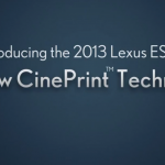
Maybe iPad’s aren’t the death of print. Lexus has launched Cineprint™ to animate the advances of the new 2013 Lexus ES in a truly unique way.
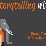
Running up to their big Storytelling Lab Day this October, Ogilvy London asked some of its key partners to come in and talk about the many different aspects of storytelling week-by-week in the form of a Lab Lunch. This past week JESS3’s information design director, Tiffany, presented to the Ogilvy team all about visual storytelling with data.

What do you get when you blend expertly designed icons, a Brit who blogs under the headline “I should really get out more,” and the dopest sci-fi plot of all time? (Sorry Trekkies.) You get the third edition of Wayne Dorrington’s take on Star Wars.

![]() by Jesse Thomas
by Jesse Thomas
When most of us under a certain age think of newspapers, we think of dead trees fueling a dying business. Not so at the Washington Post. There, media is evolving to meet the demands of an increasingly digital-savvy consumer base who require information being presented in unique, digestible and shareable ways. At the helm of that effort is Wilson Andrews, the Post’s Information Designer. I caught up with Wilson this week and chatted about his work, his background in journalism and what’s playing on his mp3 player these days.

![]() by Lauren Cook
by Lauren Cook
These days, curation — especially in the digital realm — is becoming one of those “it” terms to throw around if you want to be on-point talking about solutions to deal with content abundance.
Have you seen Wayne Dorrington’s work visualizing the plots of the first two Star Wars movies? If not, you’re missing out. Wayne is a creative designer and illustrator in London who — judging by the self-description atop his blog — looks like the love-child of Christina Hendricks and Paul Bunyan. I caught up with Wayne recently and […]

Acting as a sponsor, panelist contributor, blogger lounge leader, social content curator and charging station provider, Samsung is fast proving it is a friend and staple of SXSWi 2011. But perhaps its biggest and most visible contribution yet is its the 12-screen media wall, displaying real time geosocial check-ins, popular panels, trending topics and photos.