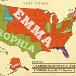
Is your name Olivia? you must live in the state of Washington. The name that parents give their child reveals their hopes, ambitions and possibly the traditions, that they’ve inherited from their ancestry. Little do they know that how popular these names can be. Do you know how popular the names Emma and Sophia are? […]
Tag: maps
The Graphic Account: April 17, 2013
Talk about big data! This week we found a map of the Internet, an infographic of the loneliest islands on Earth, and a visualization of the distance to Mars in pixels. We think you’ll also get a kick out of a video game based on infographics and Persian rugs made from Google Maps images.
The Graphic Account: March 21, 2013
The data visualizations we found this week are extensive in their scope: a whole year in the life of a man, every recorded meteorite, all the Twitter relationships between the company’s employees.
The Graphic Account: March 14, 2013
From antique cartography to personalized logs, lots of beautiful connections mapped out this week! We also found visualizations that make sense of mythological relationships, suss out the virality of content, and a font like none other.
The Graphic Account: February 25, 2013
This week’s roundup is a good reminder of how visualizations add to the stories that raw data tells. From carbon emissions to Batman, this crop of data visualizations lead us to some astonishing insights
The Graphic Account: February 18, 2013
Where do people checkin in your town? What do people name their dogs in New York City? This edition of The Graphic Account answers all these questions and more.
The Graphic Account: February 1, 2013
With a new book release from Nathan Yau, two visualizations that examine the word choice of inaugural addresses, and a chart of sci-fi book covers, this edition of the Graphic Account gets literary. Along with being a bit bookish, look out for the most elegant solution to bus schedules that public transit could ever hope for.
The Graphic Account: 1-23-13
Once the go-to small talk topic, you can now have a serious conversation about the weather. This week, we found an interactive map that uses data about climate to lead to incredible discoveries. Other highlights include a visualization that may determine your Oscar picks and the origins of the infographic.
New Zealand Google Maps Mashup Roundup
New Zealand maps and attractions via Google Maps Mania.