We’ve been particularly intrigued lately by sites that make use of infinite scroll to create stories that are both interactive and beautiful. Whether they present their data chronologically or in a taxonomy of ideas, these sites combine a multitude of data processing to help the viewer absorb the information in stages. Innovative and fresh, we’ve chosen three that we believe do a first-class job of piecing up the data bit by bit.
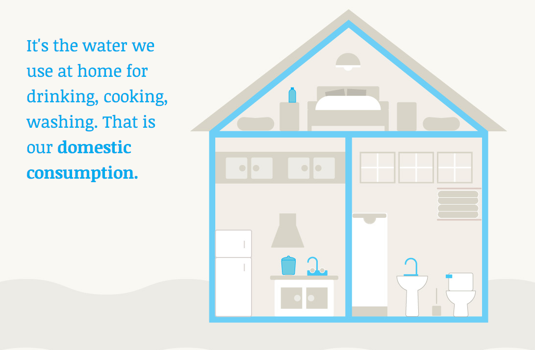
Distinguished speaker, teacher, and information designer Angela Morelli presents the unseen daily usage of water per person in “The Water we Eat” — accounting for not only the domestic, but also industrial and food-based consumption, we go through each day. Part wake up call to the growing depletion of water and part inspirational appeal to a more conscious consumption of our food and amenities, this “infographic story” paints a full picture of a large and complex world issue.
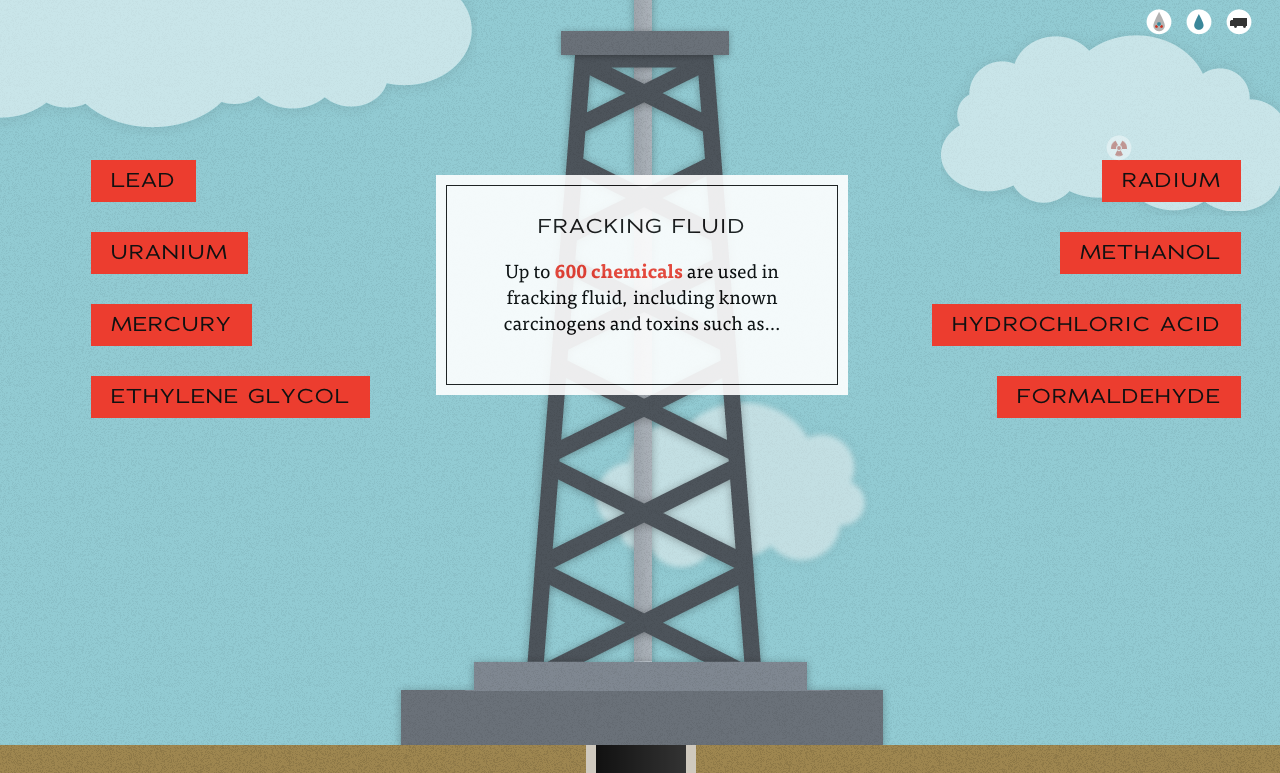
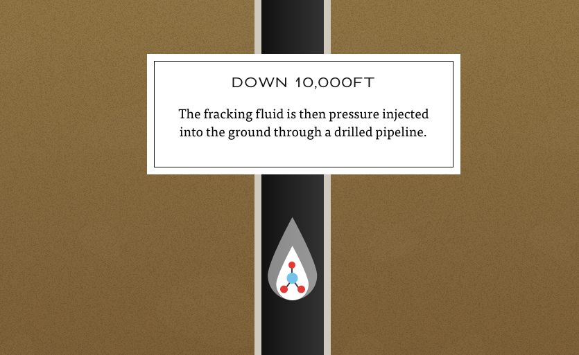
In a similar vein, we found a site that looks at the effects of hydraulic fracking. Created by designer Linda Dong, the interactive story is part of a campaign against fracking’s harmful impact on the earth. Showing the procedure from beginning to end, you are taken through the steps, seeing how much water and chemicals are used to produce 300,000 barrels of natural gas a day, but at the price of numerous environmental, safety, and health hazards.
To end, we found a great flowing timeline of iconic furniture pieces, created by design group LLI. Scrolling down, chairs created by celebrated designers such as Norman Cherner seamlessly flow from one to the next, seating you in the time period when they were made.
Did we miss any good scrolls? What other interactive features grab your attention?
]]>We’ve been particularly intrigued lately by sites that make use of infinite scroll to create stories that are both interactive and beautiful. Whether they present their data chronologically or in a taxonomy of ideas, these sites combine a multitude of data processing to help the viewer absorb the information in stages. Innovative and fresh, we’ve chosen three that we believe do a first-class job of piecing up the data bit by bit.
Distinguished speaker, teacher, and information designer Angela Morelli presents the unseen daily usage of water per person in “The Water we Eat” — accounting for not only the domestic, but also industrial and food-based consumption, we go through each day. Part wake up call to the growing depletion of water and part inspirational appeal to a more conscious consumption of our food and amenities, this “infographic story” paints a full picture of a large and complex world issue.
In a similar vein, we found a site that looks at the effects of hydraulic fracking. Created by designer Linda Dong, the interactive story is part of a campaign against fracking’s harmful impact on the earth. Showing the procedure from beginning to end, you are taken through the steps, seeing how much water and chemicals are used to produce 300,000 barrels of natural gas a day, but at the price of numerous environmental, safety, and health hazards.


To end, we found a great flowing timeline of iconic furniture pieces, created by design group LLI. Scrolling down, chairs created by celebrated designers such as Norman Cherner seamlessly flow from one to the next, seating you in the time period when they were made.
Did we miss any good scrolls? What other interactive features grab your attention?
]]>
The data visualizations we found this week are extensive in their scope: a whole year in the life of a man, every recorded meteorite, all the Twitter relationships between the company’s employees. That much data is hard to sum up, so we’ll dive right in! After you’ve caught up on the best in this week’s information design, check out our past posts.
[Information Design] Felton’s 2012 Annual Report
It’s that time of year again! Nicholas Felton has released his annual report. To meticulously record his day-to-day activities this year, he used a custom-built iPhone app called Reporter. Each day at random intervals the app would send him reminders to fill in a short survey with data that formed the basis of his beautifully designed report. Check it out!
[Book] Map of the World
A fascinating collection of work by the new generation of map makers and illustrators that not only takes a look at more traditional forms of cartography, but also features an array of contemporary examples showcasing unique representations of this classic art form. Purchase your copy from Gestalten.
[Visualization] WIDE
The World Inequality Database on Education, created by Interactive Things (IXT), uses clean and simple visualizations to demonstrate how different circumstances, such as wealth, gender or location, impact the opportunities for education and life. A tremendous amount of data to explore.
[Visualization] Mapping Relationships of Twitter Employees
Using publicly available information, Santiago Ortiz created this incredibly detailed interactive network map of the relationships between every Twitter employee as determined by their Twitter conversations. The pink lines represent incoming Tweets, and the blue lines show the outgoing Tweets, with the circles sized by Tweet frequency.
[Visualization] Every Meteorite on Earth Mapped
Javier de la Torre, cofounder of CartoDB, used data from the Meteoritical Society to map every recorded meteorite impact going all the way back to 2,300 BCE. The interactive visualization allows the viewer to zoom to any location on Earth to see if a meteorite has fallen near there, when it fell and its size. Fascinating stuff!
[Information Design] Pop-up Budapest Infographics
Livia Hasenstaub combined simple paper-folding techniques with basic charts to create this delightful little pop-up book which visualizes data about her home city, Budapest.
[Tools] Word Tree
This handy web app takes your pasted text and generates a word tree. There is even a bookmarklet that allows you to transform any webpage into a rich word-based visualisation. Neat!
[Article] Visualization Makes Things Real
In this short read, Robert Kosara of Eager Eyes explains the importance of choosing the right visualization method to represent numbers and statistics — and how easy it can be to mislead the viewer by choosing the wrong one.
[Article] Pies vs. Slopes
Pie charts may be an attractive form of data presentation, but it’s certainly not the most efficient or useful. VizWiz takes a brief look at the benefits of using slope graphs as an alternative to the classic pie for ease of understanding and comparison.
]]>
The data visualizations we found this week are extensive in their scope: a whole year in the life of a man, every recorded meteorite, all the Twitter relationships between the company’s employees. That much data is hard to sum up, so we’ll dive right in! After you’ve caught up on the best in this week’s information design, check out our past posts.
[Information Design] Felton’s 2012 Annual Report
It’s that time of year again! Nicholas Felton has released his annual report. To meticulously record his day-to-day activities this year, he used a custom-built iPhone app called Reporter. Each day at random intervals the app would send him reminders to fill in a short survey with data that formed the basis of his beautifully designed report. Check it out!
[Book] Map of the World
A fascinating collection of work by the new generation of map makers and illustrators that not only takes a look at more traditional forms of cartography, but also features an array of contemporary examples showcasing unique representations of this classic art form. Purchase your copy from Gestalten.
[Visualization] WIDE
The World Inequality Database on Education, created by Interactive Things (IXT), uses clean and simple visualizations to demonstrate how different circumstances, such as wealth, gender or location, impact the opportunities for education and life. A tremendous amount of data to explore.
[Visualization] Mapping Relationships of Twitter Employees
Using publicly available information, Santiago Ortiz created this incredibly detailed interactive network map of the relationships between every Twitter employee as determined by their Twitter conversations. The pink lines represent incoming Tweets, and the blue lines show the outgoing Tweets, with the circles sized by Tweet frequency.
[Visualization] Every Meteorite on Earth Mapped
Javier de la Torre, cofounder of CartoDB, used data from the Meteoritical Society to map every recorded meteorite impact going all the way back to 2,300 BCE. The interactive visualization allows the viewer to zoom to any location on Earth to see if a meteorite has fallen near there, when it fell and its size. Fascinating stuff!
[Information Design] Pop-up Budapest Infographics
Livia Hasenstaub combined simple paper-folding techniques with basic charts to create this delightful little pop-up book which visualizes data about her home city, Budapest.
[Tools] Word Tree
This handy web app takes your pasted text and generates a word tree. There is even a bookmarklet that allows you to transform any webpage into a rich word-based visualisation. Neat!
[Article] Visualization Makes Things Real
In this short read, Robert Kosara of Eager Eyes explains the importance of choosing the right visualization method to represent numbers and statistics — and how easy it can be to mislead the viewer by choosing the wrong one.
[Article] Pies vs. Slopes
Pie charts may be an attractive form of data presentation, but it’s certainly not the most efficient or useful. VizWiz takes a brief look at the benefits of using slope graphs as an alternative to the classic pie for ease of understanding and comparison.
]]>But what does this content actually offer an audience that makes them so intriguing in the first place? Why do some flourish and some become forgettable? Hiding in the idea of successful consumption is, good design. Good art, good marketing, heck, even a good-working stapler are all carefully crafted items. They have all been carefully designed to be easily consumed and utilized. They offer something that’s one part evocative and one part useful.
What, you may ask is evocative of a good stapler? How about the satisfaction that you have chosen a fantastic method for securing a large amount of papers, quickly? Ten more points if the stapler can secure eight pages in one click AND looks like a frog. P.S. That frog stapler will definitely be stolen by your office mate. Because it is useful AND engaging.
A properly thought out balance between function, form, and engagement are the building blocks of good design. And mastering all three of those is the key to knowing how to push an agenda on an audience.
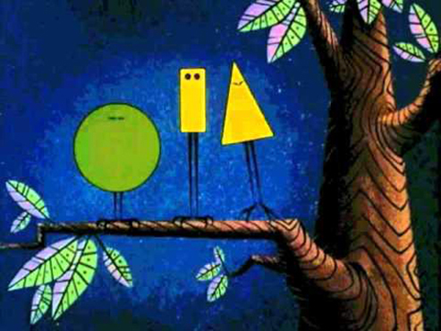
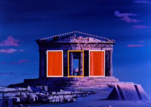
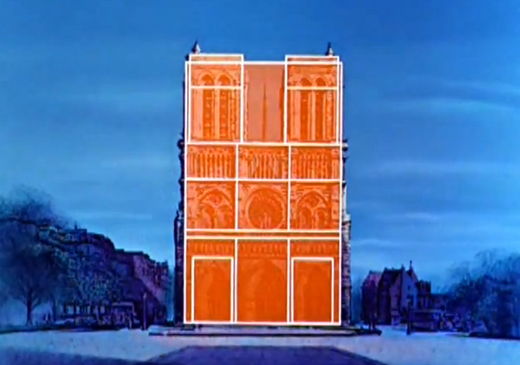
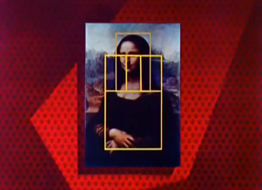
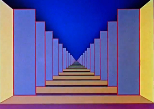
Disney understood these ideas way back in 1959 when they created, what might be thought of as an early, long-form animated infograph: Donald in Mathmagic Land. The agenda was to teach math to little kids in an engaging medium. And even though it was created over 50 years ago, it still works today. Only now it can live on YouTube as sharable web content.
That’s good design.


But what does this content actually offer an audience that makes them so intriguing in the first place? Why do some flourish and some become forgettable? Hiding in the idea of successful consumption is, good design. Good art, good marketing, heck, even a good-working stapler are all carefully crafted items. They have all been carefully designed to be easily consumed and utilized. They offer something that’s one part evocative and one part useful.
What, you may ask is evocative of a good stapler? How about the satisfaction that you have chosen a fantastic method for securing a large amount of papers, quickly? Ten more points if the stapler can secure eight pages in one click AND looks like a frog. P.S. That frog stapler will definitely be stolen by your office mate. Because it is useful AND engaging.
A properly thought out balance between function, form, and engagement are the building blocks of good design. And mastering all three of those is the key to knowing how to push an agenda on an audience.
Disney understood these ideas way back in 1959 when they created, what might be thought of as an early, long-form animated infograph: Donald in Mathmagic Land. The agenda was to teach math to little kids in an engaging medium. And even though it was created over 50 years ago, it still works today. Only now it can live on YouTube as sharable web content.
That’s good design.
