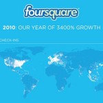
Our friends and frequent collaborators at foursquare just released an infographic outlining their tremendous 3400% growth in the past year. The infographic maps out where most check-ins took place around the globe, what the top train station, wine bars and hotels were (our NYC home away from home, the Ace Hotel, topped the list) along […]
Tag: infographics
the Twitterverse v1.0
Think you know everything there is to know about the wonderful world of Twitter apps? Since its debut in 2006, Twitter has grown to be an invaluable tool both professionally and socially for its millions of users. In Spring of 2009, we partnered with Brian Solis to create a graphic which mapped out the dozens […]
teaming up with Eloqua for The Blog Tree
As a follow up to our award-winning marketing work with Eloqua (The Content Grid, The Social Media Playbook, and A Case for Content), we have released an exciting new graphic today: The Blog Tree. The Blog Tree maps out the marketing blog structure from the most prominent blogs at the roots through the leaves which […]
Samsung Celebrating that “Social Websites Are Good for Business”
Earlier this Fall, Samsung re-launched its U.S. website with a focus on consumer engagement, driving social media experiences and online community participation. By adding a number of new features – from consumer reviews to Q&As and Twitter and Facebook buttons, Samsung not only allowed the consumer to feel like he or she is part of […]
the Yahoo! Year in Review 2010 Infographic
Each year around this time, Yahoo! releases a list of “standout news, pop-culture trends, and search obsessions” culled from the most widely used terms on the popular search engine. The top ten list includes no real surprises: pop stars and actresses, the unescapable Justin Bieber, the equally unescapable BP Oil Plugin, and the nation’s favorite […]
Yahoo! Ask America Infographic by JESS3 – America Speaks: the Top Issues by Region
The third in our series of infographics with Yahoo! News Ask America displays America’s most important issues by region, mere days before the upcoming 2010 elections. Interestingly enough, what we’ve found is that Americans seem to be more united in thought than we might expect. In both the Southeast and Western Midwest, Charlie Crist is […]
The Vault Index Summer 2010, by JESS3
The Visual Loop posts a link to Jess3’s “Vault Index” infographic.
the Perfect Market Vault Index Top 10 Infographic
By now it’s clear to all that the internet and social media have completely changed the worlds of news, advertising and marketing. Despite all of this, the team at Perfect Market team made an observation this summer: real stories still matter. To illustrate their findings, JESS3 designed an infographic displaying which stories were the most […]
the Conversation Prism v3.0 by Brian Solis and JESS3
For the third year in a row, Brian Solis and JESS3 have partnered to map out the social media landscape. First launched in 2008, the The Conversation Prism, changes with every passing month as social media continues to grow and evolve, platforms appear, disappear, acquire each other, and get renamed. This third version of the […]
Yahoo! Ask America Infographic by JESS3 shows us what America really thinks
A recent survey which received nearly 1.7 million responses found that 51% support the extension of Bush’s tax cuts only for the middle class, while the remaining 49% felt the tax cuts should remain in place for all income brackets. This is just one of dozens of questions asked in Yahoo’s Ask America, a unique […]