Tag: infographics

The Graphic Account: 1-23-13

Once the go-to small talk topic, you can now have a serious conversation about the weather. This week, we found an interactive map that uses data about climate to lead to incredible discoveries. Other highlights include a visualization that may determine your Oscar picks and the origins of the infographic.
How Fast Is Santa Claus? JESS3 Puts it into Perspective

Let’s start with the facts: Santa Claus is magical. Regardless of whether or not you believe in him (or magic, for that matter), the man deserves some credit—and frequent flier miles—for what is undoubtedly the largest seasonal productivity spike in the global workforce. In one night, Santa and his reindeer, plus an immeasurable payload of […]

The End Is…Probably Not Very Near

It’s the end of world as we know it…or is it? The Maya Long Count calendar reaches the end of its cycle this Friday, December 21, and various doomsday theories have predicted either an apocalypse or a global spiritual transformation. We’re hoping for the latter rather than the former, but all signs seem to be pointing to nothing special happening, as NASA points out.

Did Hurricane Sandy Cut the Power on Social Media? Mindjet and Kinvey Tell the Story

It’s been two weeks since Hurricane Sandy hit the East Coast, and the tales of its devastation have since been told across every imaginable media platform, with details captured in real-time as they happened and after-the-fact pieces that captured the broader scope of the once-in-a-generation event. Today, Mindjet posted a piece entitled Hurricane #Sandy: Socializing Traditional […]

What Makes a Good Infographic? Part 1

What’s the difference between a good infographic and a bad one? Recently, we discussed this idea with some of our peers in the Society of Digital Agencies (SoDA). In part 1, I take the editorial perspective on good infographics. Tomorrow, in part 2, our Information Design Director, Tiffany Farrant-Gonzalez, will tackle the design perspective.

Eating The Message

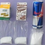
Ingredients make visual storytelling a delicious success. Pie charts are literal, cookbooks are visual, and call-to-action messages bring in the scents. What inspired this post? A 5th grader’s science project whose online success has displayed the triumphs of visual storytelling and reveals something about our culture. We are Eating The Message.