This week’s roundup is a good reminder of how visualizations add to the stories that raw data tells. From carbon emissions to Batman, this crop of data visualizations lead us to some astonishing insights
This week’s roundup is a good reminder of how visualizations add to the stories that raw data tells. From carbon emissions to Batman, this crop of data visualizations lead us to some astonishing insights

In this Geosocial Universe 3.0 snackable, we visualize how many of the top 10,000 websites are integrated with major social platforms.

Where do people checkin in your town? What do people name their dogs in New York City? This edition of The Graphic Account answers all these questions and more.
![]() by Erik Brown
by Erik Brown
According to a recent study by the National Retail Federation, Valentine’s Day is a $18.6 billion industry. Here’s Valentine’s Day by the numbers… and GIFs.
![]() by Chris Marple
by Chris Marple
JESS3 is looking for a studio + resource manager to oversee our Highland Park office. A jack of all trades who doesn’t mind getting their hands dirty or asking the tough questions. Join us.

We took several of our favorite real (real creepy, that is) OKCupid messages and sprinkled them with design magic to make them shareable Valentine’s Day graphics. They’re kind of like the ones you might have gotten in the first grade, except…wrong. Just plain wrong. Send them to your valentine—or your worst enemy.
![]() by Tracey Carl
by Tracey Carl
Do you want to work on projects that break the Internet? Want to be part of a team of data nerds, pixel pushers, and cat video lovers? Join us.
![]() by Jesse Thomas
by Jesse Thomas
In August 2010, JESS3 took one giant step for social with the introduction of The Geosocial Universe infographic. Last year, the map got updated. And now, with changes to the social landscape occurring at lightspeed, JESS3 presents its third iteration of The Geosocial Universe.
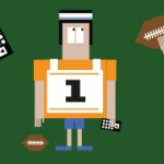
Professional football players can afford a lot of things, but only 10 of the players at this weekend’s Super Bowl XLVII, four Ravens and six 49ers, could foot the bill of one of the ads that airs during the commercial breaks.
With a new book release from Nathan Yau, two visualizations that examine the word choice of inaugural addresses, and a chart of sci-fi book covers, this edition of the Graphic Account gets literary. Along with being a bit bookish, look out for the most elegant solution to bus schedules that public transit could ever hope for.