Tag: Data Visualization

A Behind the Scenes Look at Visual.ly

As a life-long design and data visualization lover, infographics are one of my favorite pieces to create and to explore. It’s the mix of an incredible visual, snackable data and easily sharable content that is the beauty of an infographic. This is what makes Visual.ly, an infographic-sharing community, so great: it’s social data visualization at its best.

JESS3 is LeWeb’s Official Visualization Partner

JESS3 is honored this week to join many of the world’s most renowned thinkers, companies and entrepreneurs at this year’s LeWeb conference in Paris. Working closely with our Art Director Jim Hollander (SKWAK), I will be creative directing a series of visualizations that encapsulate data from Radian6 and insights from each of the panels.

5 Defining Moments at JESS3

As an entrepreneur, you spend a lot of your time looking forward and asking: where are we headed? do we have enough cash flow and resources to keep moving? what’s the next big thing? where do we want to be in 18 months?

The Content Grid v2

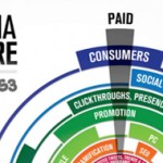
It feels like it was just yesterday that we released the first version of The Content Grid with Eloqua. I remember it particularly clearly because pitching it was my very first project as JESS3’s newest hire last June. At the time, the infographic seemed incredibly complex to me, so I broke it down in terms that I thought anyone would be able to digest, regardless of their level of experience in content marketing: “The Content Grid is a visual guideline that plots out two things: 1) who should create content and 2) how it should be distributed for the biggest sales impact.”

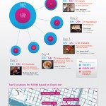
Samsung SXSWi Media Hub Infographic

It seems like it was just yesterday that the JESS3 team was in Austin, soaking in rays of Texas sunshine, scarfing down breakfast tacos and listening in on amazing panels from our industry’s brightest.