Running up to their big Storytelling Lab Day this October, Ogilvy London asked some of its key partners to come in and talk about the many different aspects of storytelling week-by-week in the form of a Lab Lunch. This past week JESS3’s information design director, Tiffany, presented to the Ogilvy team all about visual storytelling with data.
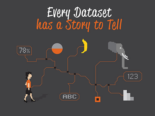
The main objective was to highlight that every dataset has a story to tell, and by presenting the data visually you’re not only freeing it from the confines of a spreadsheet, but you’re making the story accessible to your audience, inviting them to view the narrative hidden in the numbers.
People from all across the board turned out for the talk, ranging from tech to design. It was great to see so many different departments thinking about data, and the potential of visual storytelling!
So releved with the turn out for @jess3 at our lab lunch , shows that @ogilvyuk wants to make most of Data #ltf2012 twitter.com/WilliamEdHarve…
— Will Harvey (@WilliamEdHarvey) October 3, 2012
We had some really good questions at the end concerning data analysis, determining the narrative and the potential of using visual means to illustrate concepts and ideas. For additional context, I’ve included the talking points for each slide:
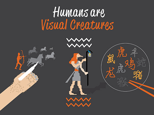
- Visual storytelling has been used for thousands of years from cave paintings to the evolution of Chinese script.
- No matter how big or small the dataset, it has a story to tell.
- “We have so much data, but we don’t know how to tame it” — Stephen Few
- It’s great to record data, but we should be thinking of ways we can use and learn from the data.
- By presenting data visually we unlock the secrets hidden with the data, and make them accessible to the audience.
- Instead of data being supplementary to a news story, the data was starting to be the star of the show! The data was driving the story! This form of journalism is what really drove the evolution of the modern form of the “infographic.”
- Presenting the information visually meant the audience could see and interact with the story hidden within the data.
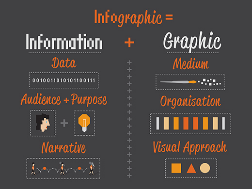
- Infographics saw the coming together of data analysis and graphic design.
- We started to see clever visual metaphors being paired with data presentation to enhance the storytelling process.
- Pretty self-explanatory for the slide above.
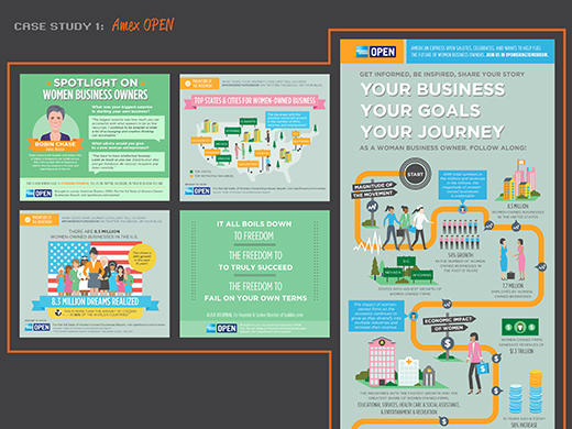
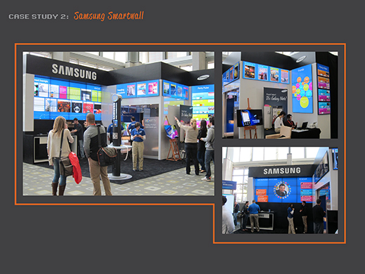
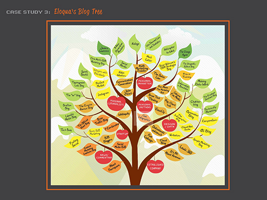
- As for the slides below (7-10) We drastically changed our strategy for each of these 4 very different forms of visual storytelling.
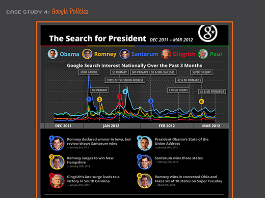
Google Politics and Electionshanks for listening! You can see more JESS3 presentations on SlideShare.net/JESS3.
Thanks for listening! You can see more like-minded presentations at SlideShare.net/JESS3.

Tags: data, data visualizaton, design, illustration, LTF2012, ogilvy, presentation, Storytelling, Storytelling lab day, Tiffany Farrant-Gonzalez, visual storytelling, visualization
Join the Conversation