Being from Oregon, I have an inherent arrogance and self-proclaimed knowledge of all things lager, amber, ales, porters, stouts, hefeweizen, microbrewed, delicious and culturally profound.
I live right next to a beer/wine bodega, specializing in unique and rich microbrews. Shopping at “Buzz Beer and Wine Shop” downtown I was confronted by a wall of beer, I’m sure every nation in the world was represented by their own brand of microbrew. I’ve always felt the power of microbrew existed in its ability to set its self apart from the commercial domestic beers (Budweiser, Coors, an so-on). Like a folk movement expressed in beer, a revolution, and a win for the little guys. Then why? I wondered: Why did all the Microbrews look alike? In a style of brewing that set itself apart in taste, did it not set itself apart in style?
I’m sure that most people are familiar, whether conscious of not, their ability to determine what dictates the style of a beer label. The signatures hop graphic cradling arched type, promising tradition and classic comfort. It’s these indicators that become a part of our daily live, we are exposed to an average of 1,500 ads, packaging, labels and logos a day. How do packaging designers stay ahead of the pack, ahead of the standard? This analogy for design trends can be seen within the case study of beer packaging. A push for labels and packaging that stands out of on the shelf, attracting new, curious consumers. I found a small collection of beer labels that strip away almost everything we come to expect from beer labels.
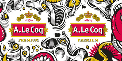
This grotesque yet playfully beautiful label from Estonian Brewery A. Le Coq managed to catch my eye. It’s not every day where brewers are willing to take such chances and show something creepy to represent their product.
I give this design 4 beer bottles out of 5.
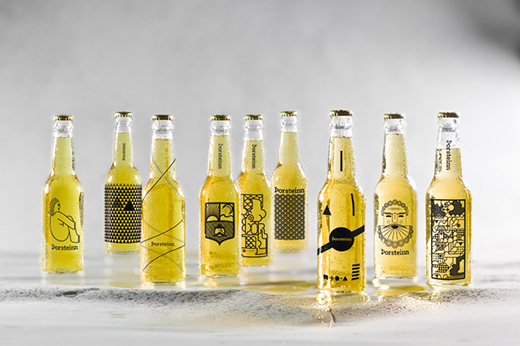
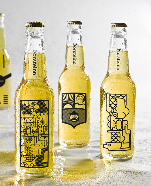
Iceland’s own Thorsteinn brewery commissioned 10 artists and designers to take a crack at this near-label-less packing design concept. This series of packaging stood out because the minimalism seemed to emphasize the glass and the beer. There were no labels covering up any potential beer viewing windows within the bottle.
I give this design 5 beer bottles out of 5.
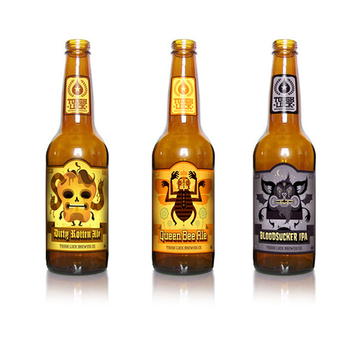
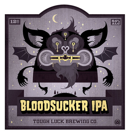
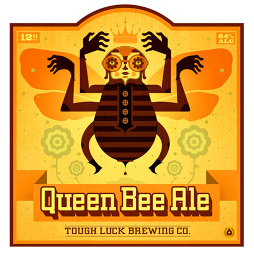
Unfortunately after much research these Labels seem to be promoting a beer company that either doesn’t exist, or currently has no web presence. That being said Graham Erwin did a fantastic job by visually interpreting the intense flavors of “Tough Luck Brewing Co.” I love the character design and these would stand out on the shelf.
I give this design 4.5 beer bottles out of 5.
Tags: artwork, design, featured, Lane Kinkade, microbrews, packaging
Join the Conversation