Originally posted on Forbes.
When most of us under a certain age think of newspapers, we think of dead trees fueling a dying business. Not so at the Washington Post. There, media is evolving to meet the demands of an increasingly digital-savvy consumer base who require information being presented in unique, digestible and shareable ways. At the helm of that effort is Wilson Andrews, the Post’s Information Designer. I caught up with Wilson this week and chatted about his work, his background in journalism and what’s playing on his mp3 player these days.

Jesse Thomas: There is a lot of talk about data visualization’s rapid ascension to prominence online as a way to accelerate the absorption of information even further than before. You’ve been working with data viz for several years, so do you feel like things have changed in that realm? Is there a shift towards visualization taking over long form journalism?
Wilson Andrews: Data visualization has definitely undergone a lot of change in the past decade. The kinds of graphics that are now being done, especially online, are on another level than what was being produced several years ago. And I think we’re only beginning to discover what can be created. There are so few boundaries online, that’s what makes it so exciting. I do think that long form journalism is just as important as it ever was, but often long form pieces are greatly enhanced by smart and clear data visualization.

Jesse: Your visualizations are often animated and complex, which often leads to a stronger narrative than static illustrations. How do you surmount the challenge of storytelling through static images when movement is not an option? Do you feel that there certain types of data sets which require movement to be told properly?
Wilson: So much of visualization is creating a clear and nearly-instant understanding of the main story that is being told. When designing a viz, I try to start at the simplest possible design and only add things like movement and interaction if they increase clarity and understanding. Static illustrations are sometimes easier to grasp, so there is much merit in utilizing that type of simple visual element.
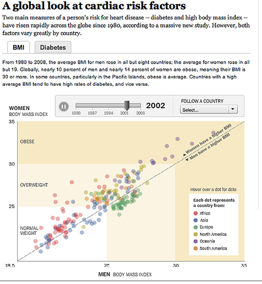
One visualization I’ve done that benefits from movement is the cardiac risk factors graphic. The reader can visually watch the world gaining weight, which presents a much more compelling picture than a static graphic plotting each nation by their change since 1980. For this type of data, it just works; it is the story that wanted to be told.

Jesse: Is there a particular data set you worked with in recent memory that startled you? Something unexpected you found yourself going back and checking?
Wilson: In the previous graphic I mentioned, diabetes rates actually dropped in most Asian countries which broke the trend of increases elsewhere in the world. We were a little surprised, and made sure to check our source.

Jesse: You received two journalism awards before you were even out of college. Was journalism something you always had a passion for? How did you first enter the field?
Wilson: I have my classmates and awesome professors to thank for those awards. They both stemmed from a documentary class trip to South America that I was lucky to be a part of. I didn’t consider journalism until I got to UNC-Chapel Hill. I enjoyed working with computers in high school, and I think I was mainly looking for an outlet for that passion. UNC’s School of Journalism has a great visual journalism program that opened up the awesome world of multimedia and interactive storytelling to me. I’m indebted to the program and highly recommend it to anyone considering visual storytelling.
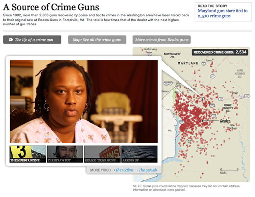
Jesse: You won two Emmys for your video work for “The Hidden Life of Guns” story. Can you tell us more about the project and your approach to it? Did you ever imagine you would win an Emmy in your line of work?
Wilson: The “Guns” project took up the better part of 4 months for me. I ended up creating around 5 visualizations and interactive presentations for that series. It was a great collaborative effort between the investigative reporters and editors on the project. The pieces I did on the Emmy-winning videos were rather small and simple motion graphics to illustrate a few of the facts in the video script. I like to think of the Emmys as reward for all the work I did on the series. I was lucky to be included in Ben de la Cruz’s great work.

Jesse: I noticed that you minored in music. Do you still find the time to play when you’re not working?
Wilson: I don’t play as much as I would like, but I still play every week. I’m always open to playing with other musicians. That’s what I enjoy most.
Jesse: What’s playing on your iPod these days?
Wilson: Bassnectar, Umphrey’s McGee, Pretty Lights, My Morning Jacket, Bon Iver, Radiohead, Bela Fleck. I like a lot of different music, and am always looking for new stuff.
Disclosure: JESS3 has previously worked with the Washington Post.
Tags: interview, jesse thomas, visualization, washington post, wilson andrews
Join the Conversation