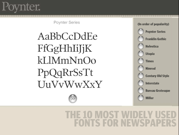
A study released on Nov. 9, 2004 found that newspapers use only a few typefaces even though there are many more available for newspaper design.
The study, conducted by Ascender Corporation from Sept. 30-Oct. 22, also found that many of the typefaces were designed specifically for the newspapers. Thirty-five out of the 97 newspapers studied use a custom-designed typeface in addition to fonts that can be purchased “off the shelf.”
An analysis of the typefaces used by nearly 100 leading newspapers shows that 10 fonts have emerged as industry leaders. According to the study, the 10 most popular typeface families (in order) are: Poynter (36 newspapers), Helvetica (28), Franklin Gothic (27), Times (20), Utopia (12), Nimrod (9), Century Old Style (8), Interstate (8), Bureau Grotesque (7), and Miller (7).
The study was conducted by examining PDF versions of newspapers that are posted on Newseum’s Web site.
Using the “Today’s Front Pages” section, Ascender examined 85 newspapers that embed their font information with the PDF file. Fifteen newspapers were either not posted on Newseum’s site, or didn’t have embedded font information. The Font Bureau, a Boston-based type foundry, provided typeface information for 12 of those 15 newspapers.
Ascender said it could not determine fonts for three newspapers.
Some newspapers have links on their Web sites to the printed pages in a PDF format exactly as they were printed that day. Fonts for the newspaper can be embedded with the PDF, or the newspaper can use fonts that are close approximations of the newsprint fonts.
Electronic editions of newspapers raises many questions. First, if a newspaper uses “off the shelf” fonts what are the restrictions that would prevent them from being used for electronic editions? Are there copyright restrictions or licensing issues? And, if a newspaper has fonts designed specifically to use on newsprint how can the paper use those fonts electronically?
What does this typeface study mean for readers, designers, and publishers? It could mean better on-screen reading of newspaper Web sites, if different typefaces are designed specifically for electronic editions. But then the paper has to figure out how to better transport fonts in PDFs and other files. And, it could mean that newspapers need to figure out whether they are using custom fonts and what that means for their Web-based publications.
Bill Davis, the study’s author, says he hopes the report will stimulate discussions about typeface usage in print and online at newspapers.
“One of the things I wanted to do is find out what newspapers use for fonts in their print editions,” he said. “When you move publications to the Web it’s a whole different paradigm.”
He said the study brought up two significant issues in his mind: “That of all the thousands and thousands of typefaces out there, that certain typefaces have intended uses or work better, and certain ones work best for newspapers.” And second, that type has demanding challenges to perform.
Davis was also surprised at the wide use of custom typefaces or modifications made to fonts to make them fit the look and feel of the newspaper.
Customizing a typeface could involve something as simple as putting your newspaper’s name in front of the typeface you use most often. If you work for the Daily Bugle, and want to make sure your designers are always going to use the right version of Times New Roman for body text, you could modify the name of the font to say, “Daily Bugle Times New Roman.” This can make it easier to find in a font menu. Or, a modification can be as complex as re-designing specific characters to accommodate the newsprint you use and how the letters look on the pages.
Some frequently-used typefaces were missed since the study only looked at the front pages of newspapers, Davis said. But, the study has also helped raise many questions about where type technology in newspapers and electronic editions of newspapers may go next.
Davis said there are still a lot of unanswered questions. He said people need to think about these typeface issues upfront when considering a re-design, or their electronic editions.
Consider the restrictions if your paper uses custom fonts. Think about the typefaces your publication uses, and how you use them. Are they strictly reserved for print, or are some functions of the typefaces you use migrating over into electronic versions of the paper?
Fostering typeface discussion now might alleviate some headaches later, when new or improved technologies become available.
Tags: fonts, newspapers, typeface, websites

Join the Conversation