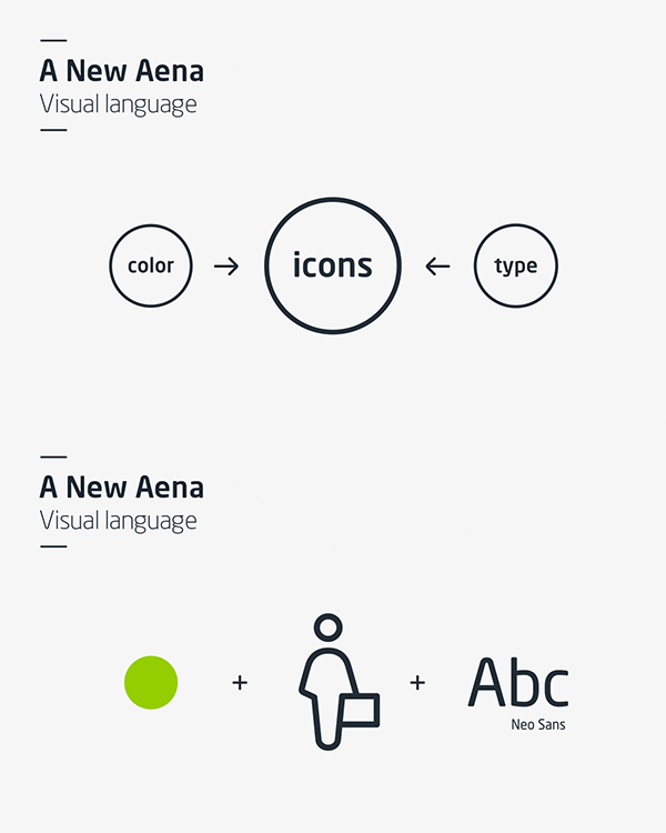
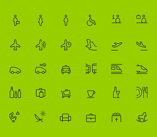
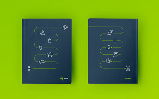
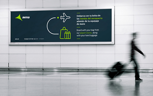
Air travel can be a confusing and frustrating experience, as anyone with a pulse can attest. An airport administration company called Aena wants to change that. They commissioned a new visual alphabet from design firm Biográfica with the goal of making the on-the-ground experience a little more seamless.

The new icons derive their shapes of Aena’s corporate font, but create a language that travelers from every country, speaking every language, can understand. Now if only there was a design-based solution to layovers…


Source:
https://www.behance.net/gallery/24586145/Aena-Visual-Language
Tags: Aena, emoji, Visual Language
Join the Conversation