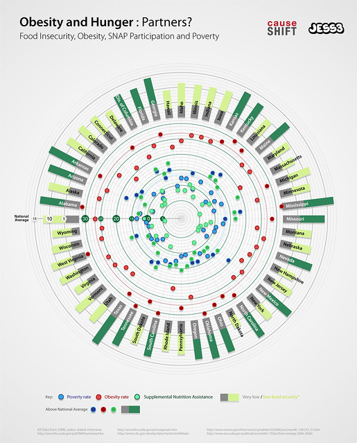
In an effort to raise awareness about both hunger in America, as well as the need for simple data visualizations to tell the story of hunger in America, Anne Mei Bertelsen of Mai Strategies and CauseShift collaborated with JESS3 to create a data-rich infographic which shows areas of hte country which have both high levels of food insecurity and high rates of obesity.
The infographic breaks out information per state, seen in the long gray and green rectangles. The different colors mean either low or very low food security if half of the state is lime green or food security above the national average if half the rectangle is filled in dark green.
The large dots throughout the graphic then corelate the poverty rate (blue)
the obesity rate (red) and supplemntal nurtirion assitance (turquoise). Those three colors are darker if that particular state’s data is higher than the national average.
Bertelsen used the graphic as her main illustration to drive home to point in her article on the Huffington Post: “Visualizing Hunger and Its Impact: Why We Need a Hunger Data Consortium”, which she concluded with the following call to arms:
“It’s time we stop hoarding data in silos — accessible only to a few. We need to create a Hunger Data Consortium and let everyone and anyone — the government, non-profits, the media and interested individuals — use it to test hypotheses and create new approaches to ending hunger in America.”

Join the Conversation